
文章目录
- 开发板:DAYU200 系统版本:OpenHarmony 3.2.2.3 SDK版本:ohos-sdk 3.2.2.3 开发工具:DevEco Studio 3.0.0.900(For OpenHarmony)
-
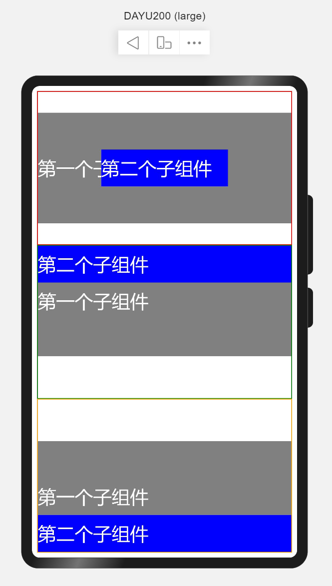
- 堆叠容器,即将子组件叠放在一起,后入先呈现的方式在UI中展示。可以理解为在箱子中装东西,最后放入箱子的在最上层。 使用场景如首页读秒跳转、页面悬浮按钮等。 简单示例(stackSimple.ets) @Entry@Componentstruct StackSimple { build() { Flex({direction: FlexDirection.Column}) { // Stack(value: {alignContent?: Alignment }) // alignContent: Alignment 默认Center 设置子组件在容器内的对齐方式,可缺省 // 设置子组件在容器内的对齐方式为默认,即居中对齐 Stack() { Text('第一个子组件').width('100%').height(300) .fontSize(50).fontColor(Color.White) .backgroundColor(Color.Grey) Text('第二个子组件').width('50%').height(100) .fontSize(50).fontColor(Color.White) .backgroundColor(Color.Blue) } .layoutWeight(1) .border({ width: 2, style: BorderStyle.Solid, color: Color.Red }) // 设置子组件在容器内的对齐方式为顶部对齐 Stack({alignContent: Alignment.Top}) { Text('第一个子组件').width('100%').height(300) .fontSize(50).fontColor(Color.White) .backgroundColor(Color.Grey) Text('第二个子组件').width('100%').height(100) .fontSize(50).fontColor(Color.White) .backgroundColor(Color.Blue) } .layoutWeight(1) .border({ width: 2, style: BorderStyle.Solid, color: Color.Green }) // 设置子组件在容器内的对齐方式为底部对齐 Stack({alignContent: Alignment.Bottom}) { Text('第一个子组件').width('100%').height(300) .fontSize(50).fontColor(Color.White) .backgroundColor(Color.Grey) Text('第二个子组件').width('100%').height(100) .fontSize(50).fontColor(Color.White) .backgroundColor(Color.Blue) } .layoutWeight(1) .border({ width: 2, style: BorderStyle.Solid, color: Color.Orange }) } .width('100%') .height('100%') .padding(14) }} 详细参见:Stack堆叠容器组件
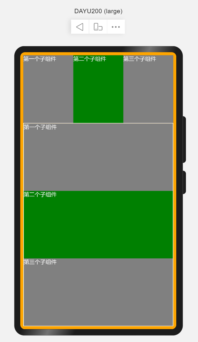
- 弹性布局容器也可称为弹性盒子,并提供了两根轴线,分别为主轴和交叉轴,主轴的方向由direction属性设置,交叉轴始终垂直于主轴。使用场景相对较多,如列表展示、布局划分等。 简单示例(flexSimple.ets) @Entry@Componentstruct FlexSimple { build() { // Flex(options?:{direction?:FlexDirection,wrap?:FlexWrap,justifyContent?:FlexAlign,alignItems?:ItemAlign,alignContent?:FlexAlign}) // direction: 子组件在Flex容器上排列的方向,即主轴的方向。默认FlexDirection.Row Flex({direction: FlexDirection.Column}) { //不设置主轴方向,默认为Row Flex() { Text('第一个子组件') .fontSize(25).fontColor(Color.White) .backgroundColor(Color.Grey) .layoutWeight(1) .height('100%') Text('第二个子组件') .fontSize(25).fontColor(Color.White) .backgroundColor(Color.Green) .layoutWeight(1) .height('100%') Text('第三个子组件') .fontSize(25).fontColor(Color.White) .backgroundColor(Color.Gray) .layoutWeight(1) .height('100%') } .width('100%') .layoutWeight(1) // 设置主轴方向为Column Flex({direction: FlexDirection.Column}) { Text('第一个子组件') .fontSize(25).fontColor(Color.White) .backgroundColor(Color.Grey) .layoutWeight(1) .width('100%') Text('第二个子组件') .fontSize(25).fontColor(Color.White) .backgroundColor(Color.Green) .layoutWeight(1) .width('100%') Text('第三个子组件') .fontSize(25).fontColor(Color.White) .backgroundColor(Color.Gray) .layoutWeight(1) .width('100%') } .height('100%') .layoutWeight(3) .border({ width: 2, style: BorderStyle.Solid, color: Color.White }) } .width('100%') .height('100%') .padding(14) .backgroundColor(Color.Orange) }} layoutWeight 容器尺寸确定时,元素与兄弟节点主轴布局尺寸按照权重进行分配,忽略本身尺寸设置。仅在Row/Column/Flex布局中生效。 详细参见:Flex弹性布局组件。
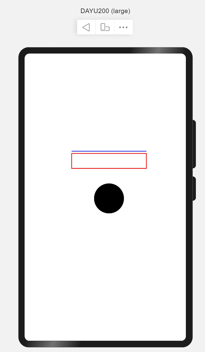
- 路径绘制组件是在固定的区域通过起点、途经点、结束点通过线条连接起来构成一个图形。形如你早上跑步,从家门口开始,绕着小区跑一圈,那么你所经过的路线构成一个不规则的圆形。使用场景绘制icon图形。 简单示例(pathSimple.ets) @Entry@Componentstruct PathSimple { build() { // Path() // width 路径所在矩形宽度 height 路径所在矩形高度 commands 路径绘制命令字符串 // commands('M起始坐标 L画直线到坐标 H画垂直直线到坐标 V画水平直线到坐标 C三次贝尔曲线到 S光滑三次贝尔曲线到 Q二次贝尔曲线到 T光滑二次贝尔曲线到 A椭圆弧 Z关闭') Flex({direction: FlexDirection.Column,justifyContent: FlexAlign.Center, alignItems: ItemAlign.Center, alignContent: FlexAlign.Center}) { // 画直线 Path().width(300).height(10).commands('M0 0 L500 0 Z').stroke(Color.Blue).strokeWidth(3) // 画矩形 Path().width(300).height(100).commands('M0 0 H500 V100 H0 Z').fill(Color.White).stroke(Color.Red).strokeWidth(3) // 画圆 Path().width(300).height(300).commands('M150 150 a100 100 0 1 1 0 1 Z') } .width('100%') .height('100%') }} 若要实现类似SVG效果的图,需要了解Shape绘制组件的父组件。 详细参见:Path路径绘制组件。
- 沿垂直方向布局的容器,即通过设置属性使其子组件在垂直方向显示。使用场景如内容列表、聊天列表等。 简单示例(columnSimple.ets) @Entry@Componentstruct ColumnSimple { build() { // Column(value:{space?:Length}) // space纵向布局元素间距 Column({space: 10}) { Text('1') .fontSize(50).fontColor(Color.White) .backgroundColor(Color.Blue) .width('100%') .textAlign(TextAlign.Center) Text('2') .fontSize(50).fontColor(Color.White) .backgroundColor(Color.Orange) .width('100%') .textAlign(TextAlign.Center) Text('3') .fontSize(50).fontColor(Color.White) .backgroundColor(Color.Green) .width('100%') .textAlign(TextAlign.Center) } .width('100%') .height('100%') .padding({ top: 20 }) }} 详细参见:Column沿垂直方向布局容器。
- 文本组件是App中最常见的用于呈现信息的组件。常用场景如用户昵称、内容列表中文本信息、文章内容信息等。 简单示例(textSimple.ets) @Entry@Componentstruct TextSimple { build() { Flex({direction: FlexDirection.Column, justifyContent: FlexAlign.Center, alignItems: ItemAlign.Center}) { // Text(content?:string) // content 文本内容 Text('Welcome to OpenHarmony!') .fontSize(50).fontColor(Color.Red).fontWeight(FontWeight.Bold) } .width('100%') .height('100%') }} 详细参见:Text文本组件。
- 路由是页面间跳转常用的API,需要在页面中导入路由模块import router from '@ohos.router',常用router.push来做应用内跳转到指定页面。 简单示例(routerSimple.ets) import router from '@ohos.router';@Entry@Componentstruct RouterSimple { build() { Flex({justifyContent: FlexAlign.Center, alignItems: ItemAlign.Center}) { Button('跳转到首页') .width(300) .height(50) .fontSize(25) .onClick(() => { router.push({ url: 'pages/index' }) }) } .width('100%') .height('100%') }} 注意:跳转页面必须是在config.json的js->pages中配置的页面。 详细参见:Router路由。
- setInterval重复调用一个函数,在每次调用之间具有固定的时间延迟。使用场景3秒后跳转页面。 简单示例(intervalSimple.ets) import router from '@ohos.router';@Entry@Componentstruct IntervalSimple { @State time: number = 3; build() { Flex({justifyContent: FlexAlign.Center, alignItems: ItemAlign.Center}) { Text(`跳过 | ${this.time} s`) .fontSize(50).fontColor(Color.White) .backgroundColor(Color.Gray) .padding(10) .width(300) .height(120) .textAlign(TextAlign.Center) .borderRadius(50) } .width('100%') .height('100%') } aboutToAppear() { let skipWait = setInterval(() => { this.time--; if (this.time === 0) { clearInterval(skipWait); router.push({url: 'pages/index'}) } }, 1000) }} 详细参见:setInterval定时器。
- 利用第3小结介绍的容器、组件及API,完成启动页,根据第2小结可知启动页由Logo、文本、以及跳过读秒组成。核心代码如下: import router from '@ohos.router';@Entry@Componentstruct Splash { @State timeMeter: number = 3; private skipWaite; build() { Stack({alignContent: Alignment.TopEnd}) { Flex({direction: FlexDirection.Column, alignItems: ItemAlign.Center, justifyContent: FlexAlign.Center}) { Flex({alignItems: ItemAlign.Center, justifyContent: FlexAlign.Center}) { Shape() { Path() .commands('M70 20 a50 50 0 0 0 0 100 Z') Path() .commands('M70 20 L300 20 L300 140 L100 140 L100 105 a15 15 0 0 0 -15 -15 a 15 15 0 0 0 -15 15 Z') Path() .commands('M300 20 a50 50 0 0 1 0 120 Z') Path() .commands('M100 120 L100 280 L250 280 L250 170 L220 170 a15 15 0 0 1 -15 -15 a15 15 0 0 1 15 -15 Z') Path() .commands('M100 280 a50 50 0 0 0 150 0 Z') } .height('400px') .width('400px') .fill(0x8B8ED7) } .layoutWeight(2) .width('100%') Flex({direction: FlexDirection.Column, alignItems: ItemAlign.Center, justifyContent: FlexAlign.Center}) { Text('叮音') .fontSize(50) .fontWeight(FontWeight.Bold) .fontColor(Color.White) Text('与乐符共舞,共普完美篇章') .fontSize(16) .fontColor(0xE5E5E5) } .layoutWeight(1) .width('100%') } .height('100%') .width('100%') Text(`跳过 | ${this.timeMeter}s`) .height(32) .fontSize(14) .fontColor(Color.White) .borderRadius(50) .backgroundColor(0xB2B2B236) .margin({ top: 20, right: 20 }) .padding({ top: 8, bottom: 8, left: 16, right: 16 }) .onClick(() => { clearInterval(this.skipWaite); }) } .width('100%') .height('100%') .linearGradient({ direction: GradientDirection.LeftTop, colors: [[0xA0EACF, 0], [0x014872, 1]] }) } aboutToAppear() { this.skipWait = setInterval(() => { this.timeMeter--; if (this.timeMeter === 0) { clearInterval(skipWait); router.push({url: 'pages/index'}) } }, 1000) }} 演示效果见: OpenHarmony App启动页及欢迎页。 想了解更多关于开源的内容,请访问: 51CTO 开源基础软件社区 https://ost.51cto.com

- 开发板:DAYU200
- 系统版本:OpenHarmony 3.2.2.3
- SDK版本:ohos-sdk 3.2.2.3
- 开发工具:DevEco Studio 3.0.0.900(For OpenHarmony)
堆叠容器,即将子组件叠放在一起,后入先呈现的方式在UI中展示。可以理解为在箱子中装东西,最后放入箱子的在最上层。 使用场景如首页读秒跳转、页面悬浮按钮等。
简单示例(stackSimple.ets)
@Entry
@Component
struct StackSimple {
 build() {
 Flex({direction: FlexDirection.Column}) {
 // Stack(value: {alignContent?: Alignment })
 // alignContent: Alignment 默认Center 设置子组件在容器内的对齐方式,可缺省
 // 设置子组件在容器内的对齐方式为默认,即居中对齐
 Stack() {
 Text('第一个子组件').width('100%').height(300)
 .fontSize(50).fontColor(Color.White)
 .backgroundColor(Color.Grey)
 Text('第二个子组件').width('50%').height(100)
 .fontSize(50).fontColor(Color.White)
 .backgroundColor(Color.Blue)
 }
 .layoutWeight(1)
 .border({
 width: 2,
 style: BorderStyle.Solid,
 color: Color.Red
 })
 // 设置子组件在容器内的对齐方式为顶部对齐
 Stack({alignContent: Alignment.Top}) {
 Text('第一个子组件').width('100%').height(300)
 .fontSize(50).fontColor(Color.White)
 .backgroundColor(Color.Grey)
 Text('第二个子组件').width('100%').height(100)
 .fontSize(50).fontColor(Color.White)
 .backgroundColor(Color.Blue)
 }
 .layoutWeight(1)
 .border({
 width: 2,
 style: BorderStyle.Solid,
 color: Color.Green
 })
 // 设置子组件在容器内的对齐方式为底部对齐
 Stack({alignContent: Alignment.Bottom}) {
 Text('第一个子组件').width('100%').height(300)
 .fontSize(50).fontColor(Color.White)
 .backgroundColor(Color.Grey)
 Text('第二个子组件').width('100%').height(100)
 .fontSize(50).fontColor(Color.White)
 .backgroundColor(Color.Blue)
 }
 .layoutWeight(1)
 .border({
 width: 2,
 style: BorderStyle.Solid,
 color: Color.Orange
 })
 }
 .width('100%')
 .height('100%')
 .padding(14)
 }
}
详细参见:Stack堆叠容器组件
弹性布局容器也可称为弹性盒子,并提供了两根轴线,分别为主轴和交叉轴,主轴的方向由direction属性设置,交叉轴始终垂直于主轴。使用场景相对较多,如列表展示、布局划分等。
简单示例(flexSimple.ets)
@Entry
@Component
struct FlexSimple {
 build() {
 // Flex(options?:{direction?:FlexDirection,wrap?:FlexWrap,justifyContent?:FlexAlign,alignItems?:ItemAlign,alignContent?:FlexAlign})
 // direction: 子组件在Flex容器上排列的方向,即主轴的方向。默认FlexDirection.Row
 Flex({direction: FlexDirection.Column}) {
 //不设置主轴方向,默认为Row
 Flex() {
 Text('第一个子组件')
 .fontSize(25).fontColor(Color.White)
 .backgroundColor(Color.Grey)
 .layoutWeight(1)
 .height('100%')
 Text('第二个子组件')
 .fontSize(25).fontColor(Color.White)
 .backgroundColor(Color.Green)
 .layoutWeight(1)
 .height('100%')
 Text('第三个子组件')
 .fontSize(25).fontColor(Color.White)
 .backgroundColor(Color.Gray)
 .layoutWeight(1)
 .height('100%')
 }
 .width('100%')
 .layoutWeight(1)

 // 设置主轴方向为Column
 Flex({direction: FlexDirection.Column}) {
 Text('第一个子组件')
 .fontSize(25).fontColor(Color.White)
 .backgroundColor(Color.Grey)
 .layoutWeight(1)
 .width('100%')
 Text('第二个子组件')
 .fontSize(25).fontColor(Color.White)
 .backgroundColor(Color.Green)
 .layoutWeight(1)
 .width('100%')
 Text('第三个子组件')
 .fontSize(25).fontColor(Color.White)
 .backgroundColor(Color.Gray)
 .layoutWeight(1)
 .width('100%')
 }
 .height('100%')
 .layoutWeight(3)
 .border({
 width: 2,
 style: BorderStyle.Solid,
 color: Color.White
 })
 }
 .width('100%')
 .height('100%')
 .padding(14)
 .backgroundColor(Color.Orange)
 }
}
-
layoutWeight 容器尺寸确定时,元素与兄弟节点主轴布局尺寸按照权重进行分配,忽略本身尺寸设置。仅在Row/Column/Flex布局中生效。
详细参见:Flex弹性布局组件。
路径绘制组件是在固定的区域通过起点、途经点、结束点通过线条连接起来构成一个图形。形如你早上跑步,从家门口开始,绕着小区跑一圈,那么你所经过的路线构成一个不规则的圆形。使用场景绘制icon图形。
简单示例(pathSimple.ets)
@Entry
@Component
struct PathSimple {
 build() {
 // Path()
 // width 路径所在矩形宽度 height 路径所在矩形高度 commands 路径绘制命令字符串
 // commands('M起始坐标 L画直线到坐标 H画垂直直线到坐标 V画水平直线到坐标 C三次贝尔曲线到 S光滑三次贝尔曲线到 Q二次贝尔曲线到 T光滑二次贝尔曲线到 A椭圆弧 Z关闭')
 Flex({direction: FlexDirection.Column,justifyContent: FlexAlign.Center, alignItems: ItemAlign.Center, alignContent: FlexAlign.Center}) {
 // 画直线
 Path().width(300).height(10).commands('M0 0 L500 0 Z').stroke(Color.Blue).strokeWidth(3)
 // 画矩形
 Path().width(300).height(100).commands('M0 0 H500 V100 H0 Z').fill(Color.White).stroke(Color.Red).strokeWidth(3)
 // 画圆
 Path().width(300).height(300).commands('M150 150 a100 100 0 1 1 0 1 Z')
 }
 .width('100%')
 .height('100%')
 }
}
- 若要实现类似SVG效果的图,需要了解Shape绘制组件的父组件。

详细参见:Path路径绘制组件。
沿垂直方向布局的容器,即通过设置属性使其子组件在垂直方向显示。使用场景如内容列表、聊天列表等。
简单示例(columnSimple.ets)
@Entry
@Component
struct ColumnSimple {
 build() {
 // Column(value:{space?:Length})
 // space纵向布局元素间距
 Column({space: 10}) {
 Text('1')
 .fontSize(50).fontColor(Color.White)
 .backgroundColor(Color.Blue)
 .width('100%')
 .textAlign(TextAlign.Center)
 Text('2')
 .fontSize(50).fontColor(Color.White)
 .backgroundColor(Color.Orange)
 .width('100%')
 .textAlign(TextAlign.Center)
 Text('3')
 .fontSize(50).fontColor(Color.White)
 .backgroundColor(Color.Green)
 .width('100%')
 .textAlign(TextAlign.Center)
 }
 .width('100%')
 .height('100%')
 .padding({
 top: 20
 })
 }
}
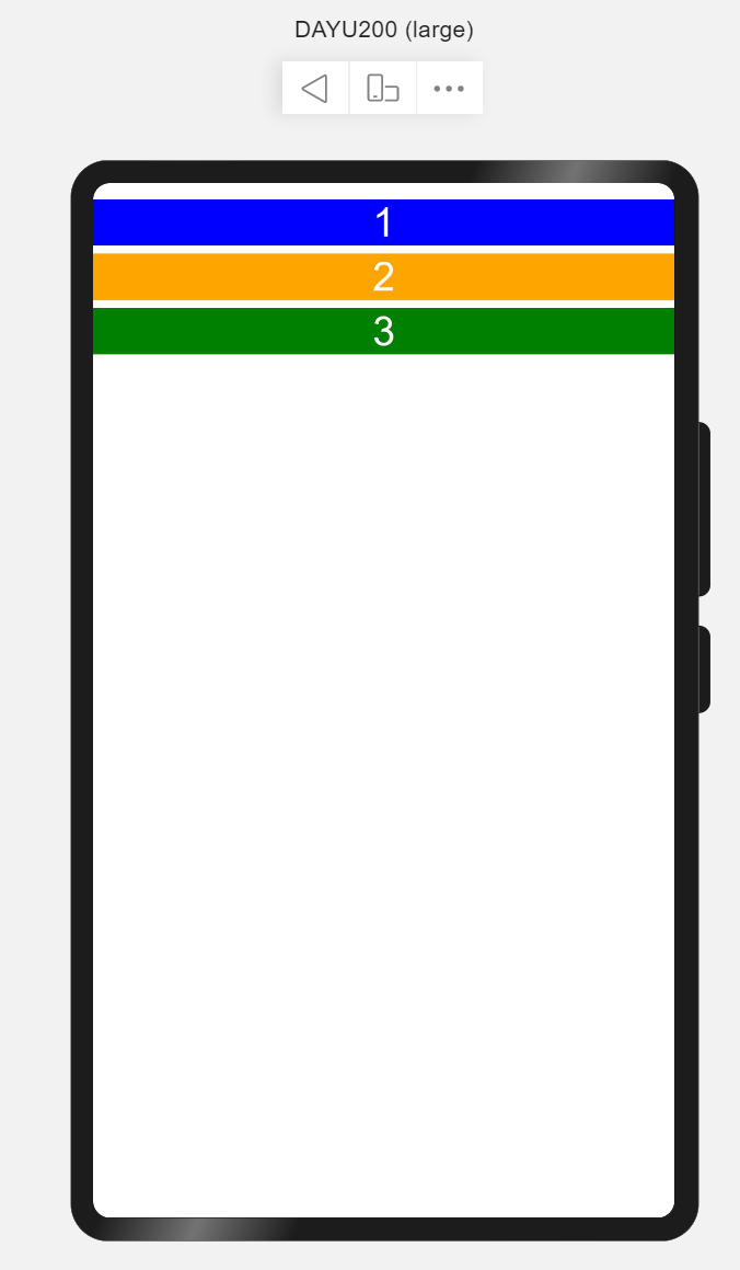
详细参见:Column沿垂直方向布局容器。
文本组件是App中最常见的用于呈现信息的组件。常用场景如用户昵称、内容列表中文本信息、文章内容信息等。
简单示例(textSimple.ets)
@Entry
@Component
struct TextSimple {
 build() {
 Flex({direction: FlexDirection.Column, justifyContent: FlexAlign.Center, alignItems: ItemAlign.Center}) {
 // Text(content?:string)
 // content 文本内容
 Text('Welcome to OpenHarmony!')
 .fontSize(50).fontColor(Color.Red).fontWeight(FontWeight.Bold)
 }
 .width('100%')
 .height('100%')
 }
}
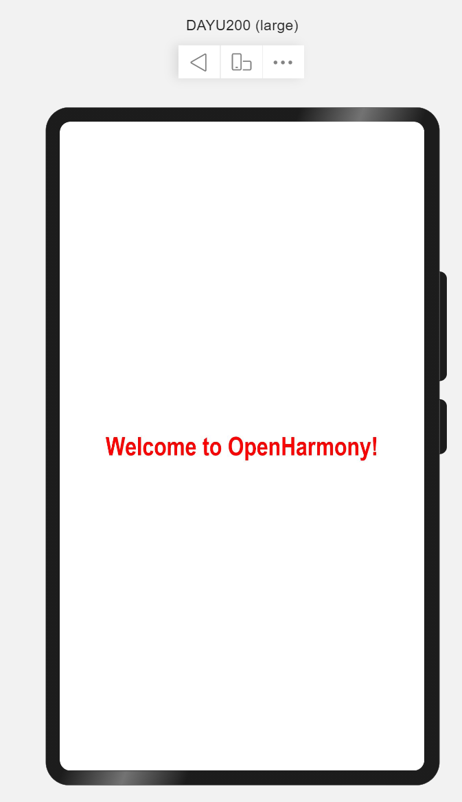
详细参见:Text文本组件。
路由是页面间跳转常用的API,需要在页面中导入路由模块import router from '@ohos.router',常用router.push来做应用内跳转到指定页面。
简单示例(routerSimple.ets)
import router from '@ohos.router';
@Entry
@Component
struct RouterSimple {
 build() {
 Flex({justifyContent: FlexAlign.Center, alignItems: ItemAlign.Center}) {
 Button('跳转到首页')
 .width(300)
 .height(50)
 .fontSize(25)
 .onClick(() => {
 router.push({
 url: 'pages/index'
 })
 })
 }
 .width('100%')
 .height('100%')
 }
}
- 注意:跳转页面必须是在
config.json的js->pages中配置的页面。
详细参见:Router路由。
setInterval重复调用一个函数,在每次调用之间具有固定的时间延迟。使用场景3秒后跳转页面。
简单示例(intervalSimple.ets)
import router from '@ohos.router';
@Entry
@Component
struct IntervalSimple {
 @State time: number = 3;
 build() {
 Flex({justifyContent: FlexAlign.Center, alignItems: ItemAlign.Center}) {
 Text(`跳过 | ${this.time} s`)
 .fontSize(50).fontColor(Color.White)
 .backgroundColor(Color.Gray)
 .padding(10)
 .width(300)
 .height(120)
 .textAlign(TextAlign.Center)
 .borderRadius(50)
 }
 .width('100%')
 .height('100%')
 }

 aboutToAppear() {
 let skipWait = setInterval(() => {
 this.time--;
 if (this.time === 0) {
 clearInterval(skipWait);
 router.push({url: 'pages/index'})
 }
 }, 1000)
 }
}
详细参见:setInterval定时器。
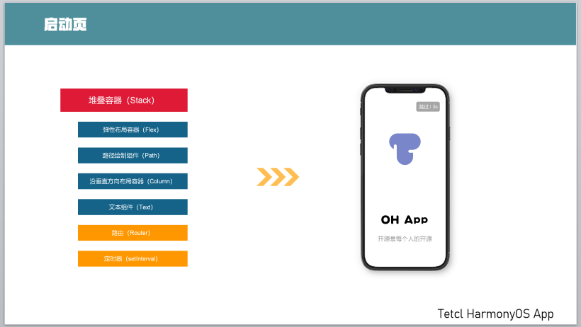
利用第3小结介绍的容器、组件及API,完成启动页,根据第2小结可知启动页由Logo、文本、以及跳过读秒组成。核心代码如下:
import router from '@ohos.router';
@Entry
@Component
struct Splash {
 @State timeMeter: number = 3;
 private skipWaite;
 build() {
 Stack({alignContent: Alignment.TopEnd}) {
 Flex({direction: FlexDirection.Column, alignItems: ItemAlign.Center, justifyContent: FlexAlign.Center}) {
 Flex({alignItems: ItemAlign.Center, justifyContent: FlexAlign.Center}) {
 Shape() {
 Path()
 .commands('M70 20 a50 50 0 0 0 0 100 Z')
 Path()
 .commands('M70 20 L300 20 L300 140 L100 140 L100 105 a15 15 0 0 0 -15 -15 a 15 15 0 0 0 -15 15 Z')
 Path()
 .commands('M300 20 a50 50 0 0 1 0 120 Z')
 Path()
 .commands('M100 120 L100 280 L250 280 L250 170 L220 170 a15 15 0 0 1 -15 -15 a15 15 0 0 1 15 -15 Z')
 Path()
 .commands('M100 280 a50 50 0 0 0 150 0 Z')
 }
 .height('400px')
 .width('400px')
 .fill(0x8B8ED7)
 }
 .layoutWeight(2)
 .width('100%')

 Flex({direction: FlexDirection.Column, alignItems: ItemAlign.Center, justifyContent: FlexAlign.Center}) {
 Text('叮音')
 .fontSize(50)
 .fontWeight(FontWeight.Bold)
 .fontColor(Color.White)
 Text('与乐符共舞,共普完美篇章')
 .fontSize(16)
 .fontColor(0xE5E5E5)
 }
 .layoutWeight(1)
 .width('100%')
 }
 .height('100%')
 .width('100%')

 Text(`跳过 | ${this.timeMeter}s`)
 .height(32)
 .fontSize(14)
 .fontColor(Color.White)
 .borderRadius(50)
 .backgroundColor(0xB2B2B236)
 .margin({
 top: 20,
 right: 20
 })
 .padding({
 top: 8,
 bottom: 8,
 left: 16,
 right: 16
 })
 .onClick(() => {
 clearInterval(this.skipWaite);
 })
 }
 .width('100%')
 .height('100%')
 .linearGradient({
 direction: GradientDirection.LeftTop,
 colors: [[0xA0EACF, 0], [0x014872, 1]]
 })
 }

 aboutToAppear() {
 this.skipWait = setInterval(() => {
 this.timeMeter--;
 if (this.timeMeter === 0) {
 clearInterval(skipWait);
 router.push({url: 'pages/index'})
 }
 }, 1000)
 }
}
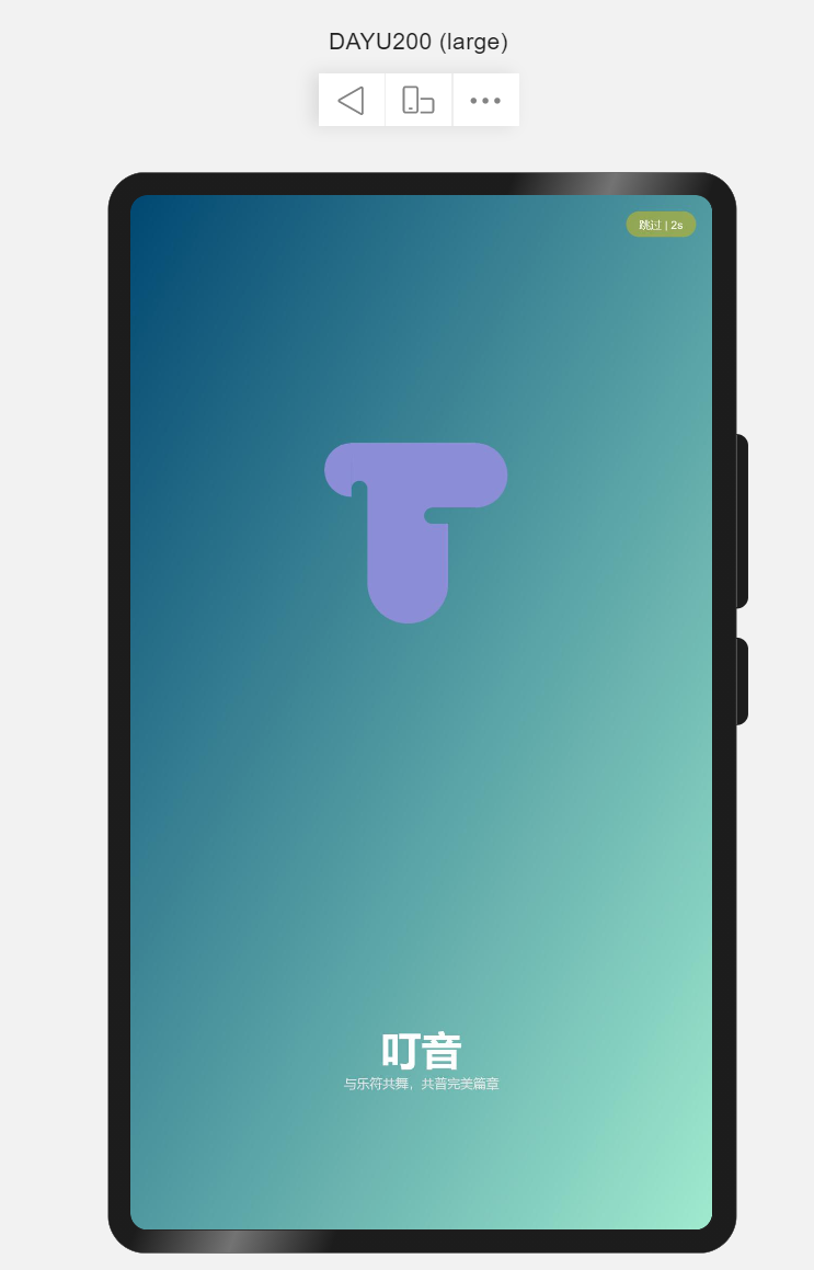
演示效果见: OpenHarmony App启动页及欢迎页。
© 版权声明
文章版权归作者所有,未经允许请勿转载。