
文章目录
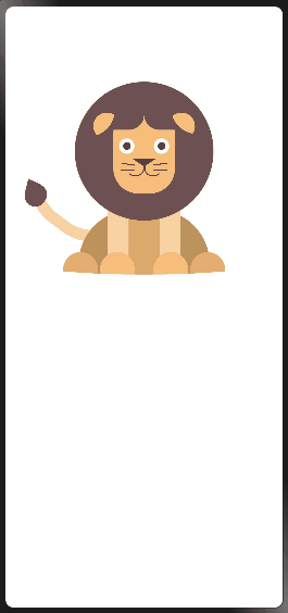
- 在做鸿蒙项目过程中,发现在H5用的CSS的式样在鸿蒙上有些属性不支持,显示效果不一样,所以做了一个卡通狮子帮助更好的在鸿蒙中熟悉CSS的用法。
-
- 通过 clip-path 属性,它是使用裁剪方式创建元素的可显示区域,其区域内的部分显示,区域外的隐藏 ,两个传入值分别表示其裁切的半径,而at后的两个值则代表裁切的x与y轴的坐标。 .ear { width: 70px; height: 70px; border-radius: 40px; position: absolute; top: 10px; z-index: 9; clip-path: ellipse(100% 100% at -20% -10%); background-color: rgb(247, 190, 123);} 同理, 类似于半圆的身体也是通过 clip-path: ellipse 来实现的 。
- 鼻子是一个三角形构成,就是把 width 与 height 设为 0,单纯使用 border 属性来完成,设置 border-width 使其代替块的宽高,但其块的内部是由四个小三角形拼成的矩形,因为排布是上右下左的顺序,所以只要给其中一个角的颜色赋值即可实现一个三角形。 .nose { width: 0; height: 0; position: absolute; left: 50%; top: 50%; transform: translate(-50%, -50%); border-width: 20px 30px; border-style: solid; margin-top: 80px; z-index: 30; border-color: rgb(89, 60, 62) transparent transparent transparent;}
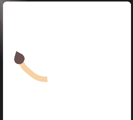
- 尾部主要是利用 border 来实现,画一个矩形div块,让他旋转一定角度,然后只绘制其中一个边框,然后再使用 border-radius: 108px 103px , 使它弯曲 。 摇尾巴的动画制作: 尾部的力量都源于尾巴根,所以要从根部进行一个轻微摇摆的旋转动画,所以,利用到了 transform-origin 属性,它可以让你更改一个元素变形的原点,如,根部发力那么就直接设置成 transform-origin: 50% 100% 也可以写成 transform-origin: center bottom 。 .tail { width: 300px; height: 300px; border-radius: 108px 130px; position: absolute; left: -230px; top: -130px; border-width: 30px; border-style: solid; border-color: transparent rgb(248, 210, 163) transparent transparent; animation: 1s wagging ease-in-out infinite alternate forwards; transform-origin: 50% 100%;} @keyframes wagging { 0% { transform: rotate(125deg) translateX(0) translateY(0px); } 100% { transform: rotate(130deg) translateX(15px) translateY(-15px); }}
-
- <div class="main"> <div class="lion"> <!-- 头部 --> <div class="head"> <!-- 头部轮廓 --> <div class="hair"></div> <!-- 脸部 --> <div class="face"> <!-- 脸部头发 --> <div class="hair"></div> <!-- 耳朵 --> <div class="ear leftEar"></div> <div class="ear rightEar"></div> <!-- 眼睛 --> <div class="eye leftEye"> <div class="eyes"></div> </div> <div class="eye rightEye"> <div class="eyes"></div> </div> <!-- 鼻子 --> <div class="nose"></div> <!-- 嘴巴 --> <div class="mouth"> <text class="mouthLeft mouths"></text> <text class="mouthRight mouths"></text> <!-- 胡须 --> <div class="mouthTopLeft"></div> <div class="mouthTopRight"></div> <div class="mouthBottomLeft"></div> <div class="mouthBottomRight"></div> </div> </div> </div> <!-- 尾巴 --> <div class="tail"> <div class="tail-lil"></div> <div class="tail-kil"></div> </div> <!-- 身体 --> <div class="body"> <div class="bodyLine"></div> <!-- 腿部和爪子 --> <div class="hand handLeft"></div> <div class="handBefore handLeftBefore"></div> <div class="handBefore handLeftAfter"></div> <div class="hand handRight"></div> <div class="handBefore handRightBefore"></div> <div class="handBefore handRightAfter"></div> </div> </div></div>
- .main { transform: scale(0.5);}/* 头部式样 */.head { width: 375px; height: 375px; z-index: 99;}/* 头部轮廓式样 */.hair { width: 360px; height: 360px; border-radius: 180px; position: absolute; left: 50%; top: 50%; transform: translate(-50%, -50%); background-color: rgb(109, 81, 80);}/* 脸部式样 */.face { width: 160px; height: 220px; border-radius: 65px; position: absolute; left: 50%; top: 50%; transform: translate(-50%, -50%); background-color: rgb(247, 190, 123);}/* 头发式样 */.face .hair { width: 120px; height: 100px; border-radius: 40px; position: absolute; top: 5px; left: 20px; box-shadow: 120px 0 0 #6D5150;}/* 耳朵式样 */.ear { width: 70px; height: 70px; border-radius: 40px; position: absolute; top: 10px; z-index: 9; clip-path: ellipse(100% 100% at -20% -10%); background-color: rgb(247, 190, 123);}.leftEar { left: -52px;}.rightEar { right: -52px; transform: rotate(90deg);}/* 眼睛式样 */.eye { width: 40px; height: 40px; border-radius: 20px; position: absolute; top: 35%; background-color: white;}.eyes { width: 20px; height: 20px; border-radius: 20px; position: absolute; left: 50%; top: 50%; transform: translate(-50%, -50%); background-color: rgb(89, 60, 62);}.leftEye { left: 15px;}.rightEye { right: 15px;}/* 鼻子式样 */.nose { width: 0; height: 0; position: absolute; left: 50%; top: 50%; transform: translate(-50%, -50%); border-width: 20px 30px; border-style: solid; margin-top: 80px; z-index: 30; border-color: rgb(89, 60, 62) transparent transparent transparent;}/* 嘴巴式样 */.mouth { width: 50px; height: 50px; position: absolute; left: 50%; top: 50%; transform: translate(-50%, -50%); margin-top: 65px;}.mouths { width: 46px; height: 50px; border-radius: 20px; border-width: 3px; border-style: solid; position: absolute; top: 8px;}.mouthLeft { left: -21px; border-color: transparent rgb(89, 60, 62) rgb(89, 60, 62) transparent;}.mouthRight{ right: -21px; border-color: transparent transparent rgb(89, 60, 62) rgb(89, 60, 62);}/* 胡须式样 */.mouth div { width: 36px; height: 3px; position: absolute; background-color: rgb(89, 60, 62);}.mouthTopLeft { left: -35px; top: 25px; transform: rotate(8deg);}.mouthTopRight { right: -35px; top: 25px; transform: rotate(-8deg);}.mouthBottomLeft { left: -35px; top: 40px; transform: rotate(-2deg);}.mouthBottomRight { right: -35px; top: 40px; transform: rotate(2deg);}/* 身体式样 */.body { width: 340px; height: 280px; position: absolute; border-radius: 160px; left: 50%; top: 340px; transform: translateX(-50%); clip-path: ellipse(200% 60% at 50% 0%); background-color: rgb(189, 146, 93);}.bodyLine { width: 90px; height: 200px; position: absolute; top: -5px; left: 50%; transform: translateX(-50%); background-color: rgb(219, 169, 108);}/* 腿部和爪子式样 */.hand { width: 55px; height: 280px; position: absolute; background-color: rgb(248, 210, 163);}.handBefore { position: absolute; width: 90px; height: 90px; background-color: rgb(247, 190, 123); top: 110px; transform: translateX(-50%); border-radius: 50px;}.handLeftBefore { left: 100px;}.handRightBefore { right: 11px;}.handLeftAfter { right: -85px; background-color: rgb(228, 174, 112);}.handRightAfter { left: 5px; background-color: rgb(228, 174, 112);}.handLeft { left: 75px; top: -50px;}.handLeft .handAfter { margin-left: -95px;}.handRight { right: 75px; top: -50px;}.handRight .handAfter { margin-left: 177px;}/* 尾巴式样 */.tail { width: 300px; height: 300px; border-radius: 108px 130px; position: absolute; left: -230px; top: -130px; border-width: 30px; border-style: solid; border-color: transparent rgb(248, 210, 163) transparent transparent; animation: 1s wagging ease-in-out infinite alternate forwards; transform-origin: 50% 100%;}.tail-lil { width: 60px; height: 55px; background-color: rgb(109, 81, 80); position: absolute; left: 205px; bottom: 0; border-radius: 40px;}.tail-kil { width: 0; height: 0; border-style: solid; border-width: 28px 34px; border-color: transparent rgb(109, 81, 80) transparent transparent; border-radius: 14px; position: absolute; bottom: -42px; left: 178px; transform: rotate(-62deg);}@keyframes wagging { 0% { transform: rotate(125deg) translateX(0) translateY(0px); } 100% { transform: rotate(130deg) translateX(15px) translateY(-15px); }}
- 鸿蒙的css中: 1. 子元素选择器不支持,伪类选择器不支持,通配选择器不支持。 2. border-radius单位只能使用px不能用%。 3. min-height单位不能用vh,只能使用px。 4. background-image属性值必须使用none或者url()。 想了解更多关于开源的内容,请访问: 51CTO 开源基础软件社区 https://ost.51cto.com。

在做鸿蒙项目过程中,发现在H5用的CSS的式样在鸿蒙上有些属性不支持,显示效果不一样,所以做了一个卡通狮子帮助更好的在鸿蒙中熟悉CSS的用法。
通过 clip-path 属性,它是使用裁剪方式创建元素的可显示区域,其区域内的部分显示,区域外的隐藏 ,两个传入值分别表示其裁切的半径,而at后的两个值则代表裁切的x与y轴的坐标。
.ear {
 width: 70px;
 height: 70px;
 border-radius: 40px;
 position: absolute;
 top: 10px;
 z-index: 9;
 clip-path: ellipse(100% 100% at -20% -10%);
 background-color: rgb(247, 190, 123);
}
同理, 类似于半圆的身体也是通过 clip-path: ellipse 来实现的 。
鼻子是一个三角形构成,就是把 width 与 height 设为 0,单纯使用 border 属性来完成,设置 border-width 使其代替块的宽高,但其块的内部是由四个小三角形拼成的矩形,因为排布是上右下左的顺序,所以只要给其中一个角的颜色赋值即可实现一个三角形。
.nose {
 width: 0;
 height: 0;
 position: absolute;
 left: 50%;
 top: 50%;
 transform: translate(-50%, -50%);
 border-width: 20px 30px;
 border-style: solid;
 margin-top: 80px;
 z-index: 30;
 border-color: rgb(89, 60, 62) transparent transparent transparent;
}
尾部主要是利用 border 来实现,画一个矩形div块,让他旋转一定角度,然后只绘制其中一个边框,然后再使用 border-radius: 108px 103px , 使它弯曲 。
摇尾巴的动画制作:
尾部的力量都源于尾巴根,所以要从根部进行一个轻微摇摆的旋转动画,所以,利用到了 transform-origin 属性,它可以让你更改一个元素变形的原点,如,根部发力那么就直接设置成 transform-origin: 50% 100% 也可以写成 transform-origin: center bottom 。
.tail {
 width: 300px;
 height: 300px;
 border-radius: 108px 130px;
 position: absolute;
 left: -230px;
 top: -130px;
 border-width: 30px;
 border-style: solid;
 border-color: transparent rgb(248, 210, 163) transparent transparent;
 animation: 1s wagging ease-in-out infinite alternate forwards;
 transform-origin: 50% 100%;
}
@keyframes wagging {
 0% {
 transform: rotate(125deg) translateX(0) translateY(0px);
 }
 100% {
 transform: rotate(130deg) translateX(15px) translateY(-15px);
 }
}
<div class="main">
 <div class="lion">
 <!-- 头部 -->
 <div class="head">
 <!-- 头部轮廓 -->
 <div class="hair"></div>
 <!-- 脸部 -->
 <div class="face">
 <!-- 脸部头发 -->
 <div class="hair"></div>
 <!-- 耳朵 -->
 <div class="ear leftEar"></div>
 <div class="ear rightEar"></div>
 <!-- 眼睛 -->
 <div class="eye leftEye">
 <div class="eyes"></div>
 </div>
 <div class="eye rightEye">
 <div class="eyes"></div>
 </div>
 <!-- 鼻子 -->
 <div class="nose"></div>
 <!-- 嘴巴 -->
 <div class="mouth">
 <text class="mouthLeft mouths"></text>
 <text class="mouthRight mouths"></text>
 <!-- 胡须 -->
 <div class="mouthTopLeft"></div>
 <div class="mouthTopRight"></div>
 <div class="mouthBottomLeft"></div>
 <div class="mouthBottomRight"></div>
 </div>
 </div>
 </div>
 <!-- 尾巴 -->
 <div class="tail">
 <div class="tail-lil"></div>
 <div class="tail-kil"></div>
 </div>
 <!-- 身体 -->
 <div class="body">
 <div class="bodyLine"></div>
 <!-- 腿部和爪子 -->
 <div class="hand handLeft"></div>
 <div class="handBefore handLeftBefore"></div>
 <div class="handBefore handLeftAfter"></div>
 <div class="hand handRight"></div>
 <div class="handBefore handRightBefore"></div>
 <div class="handBefore handRightAfter"></div>
 </div>
 </div>
</div>
<div class="lion">
<!-- 头部 -->
<div class="head">
<!-- 头部轮廓 -->
<div class="hair"></div>
<!-- 脸部 -->
<div class="face">
<!-- 脸部头发 -->
<div class="hair"></div>
<!-- 耳朵 -->
<div class="ear leftEar"></div>
<div class="ear rightEar"></div>
<!-- 眼睛 -->
<div class="eye leftEye">
<div class="eyes"></div>
</div>
<div class="eye rightEye">
<div class="eyes"></div>
</div>
<!-- 鼻子 -->
<div class="nose"></div>
<!-- 嘴巴 -->
<div class="mouth">
<text class="mouthLeft mouths"></text>
<text class="mouthRight mouths"></text>
<!-- 胡须 -->
<div class="mouthTopLeft"></div>
<div class="mouthTopRight"></div>
<div class="mouthBottomLeft"></div>
<div class="mouthBottomRight"></div>
</div>
</div>
</div>
<!-- 尾巴 -->
<div class="tail">
<div class="tail-lil"></div>
<div class="tail-kil"></div>
</div>
<!-- 身体 -->
<div class="body">
<div class="bodyLine"></div>
<!-- 腿部和爪子 -->
<div class="hand handLeft"></div>
<div class="handBefore handLeftBefore"></div>
<div class="handBefore handLeftAfter"></div>
<div class="hand handRight"></div>
<div class="handBefore handRightBefore"></div>
<div class="handBefore handRightAfter"></div>
</div>
</div>
</div>
.main {
 transform: scale(0.5);
}
/* 头部式样 */
.head {
 width: 375px;
 height: 375px;
 z-index: 99;
}
/* 头部轮廓式样 */
.hair {
 width: 360px;
 height: 360px;
 border-radius: 180px;
 position: absolute;
 left: 50%;
 top: 50%;
 transform: translate(-50%, -50%);
 background-color: rgb(109, 81, 80);
}
/* 脸部式样 */
.face {
 width: 160px;
 height: 220px;
 border-radius: 65px;
 position: absolute;
 left: 50%;
 top: 50%;
 transform: translate(-50%, -50%);
 background-color: rgb(247, 190, 123);
}
/* 头发式样 */
.face .hair {
 width: 120px;
 height: 100px;
 border-radius: 40px;
 position: absolute;
 top: 5px;
 left: 20px;
 box-shadow: 120px 0 0 #6D5150;
}
/* 耳朵式样 */
.ear {
 width: 70px;
 height: 70px;
 border-radius: 40px;
 position: absolute;
 top: 10px;
 z-index: 9;
 clip-path: ellipse(100% 100% at -20% -10%);
 background-color: rgb(247, 190, 123);
}
.leftEar {
 left: -52px;
}
.rightEar {
 right: -52px;
 transform: rotate(90deg);
}
/* 眼睛式样 */
.eye {
 width: 40px;
 height: 40px;
 border-radius: 20px;
 position: absolute;
 top: 35%;
 background-color: white;
}
.eyes {
 width: 20px;
 height: 20px;
 border-radius: 20px;
 position: absolute;
 left: 50%;
 top: 50%;
 transform: translate(-50%, -50%);
 background-color: rgb(89, 60, 62);
}
.leftEye {
 left: 15px;
}
.rightEye {
 right: 15px;
}
/* 鼻子式样 */
.nose {
 width: 0;
 height: 0;
 position: absolute;
 left: 50%;
 top: 50%;
 transform: translate(-50%, -50%);
 border-width: 20px 30px;
 border-style: solid;
 margin-top: 80px;
 z-index: 30;
 border-color: rgb(89, 60, 62) transparent transparent transparent;
}
/* 嘴巴式样 */
.mouth {
 width: 50px;
 height: 50px;
 position: absolute;
 left: 50%;
 top: 50%;
 transform: translate(-50%, -50%);
 margin-top: 65px;
}
.mouths {
 width: 46px;
 height: 50px;
 border-radius: 20px;
 border-width: 3px;
 border-style: solid;
 position: absolute;
 top: 8px;
}
.mouthLeft {
 left: -21px;
 border-color: transparent rgb(89, 60, 62) rgb(89, 60, 62) transparent;
}
.mouthRight{
 right: -21px;
 border-color: transparent transparent rgb(89, 60, 62) rgb(89, 60, 62);
}
/* 胡须式样 */
.mouth div {
 width: 36px;
 height: 3px;
 position: absolute;
 background-color: rgb(89, 60, 62);
}
.mouthTopLeft {
 left: -35px;
 top: 25px;
 transform: rotate(8deg);
}
.mouthTopRight {
 right: -35px;
 top: 25px;
 transform: rotate(-8deg);
}
.mouthBottomLeft {
 left: -35px;
 top: 40px;
 transform: rotate(-2deg);
}
.mouthBottomRight {
 right: -35px;
 top: 40px;
 transform: rotate(2deg);
}
/* 身体式样 */
.body {
 width: 340px;
 height: 280px;
 position: absolute;
 border-radius: 160px;
 left: 50%;
 top: 340px;
 transform: translateX(-50%);
 clip-path: ellipse(200% 60% at 50% 0%);
 background-color: rgb(189, 146, 93);
}
.bodyLine {
 width: 90px;
 height: 200px;
 position: absolute;
 top: -5px;
 left: 50%;
 transform: translateX(-50%);
 background-color: rgb(219, 169, 108);
}
/* 腿部和爪子式样 */
.hand {
 width: 55px;
 height: 280px;
 position: absolute;
 background-color: rgb(248, 210, 163);
}
.handBefore {
 position: absolute;
 width: 90px;
 height: 90px;
 background-color: rgb(247, 190, 123);
 top: 110px;
 transform: translateX(-50%);
 border-radius: 50px;
}
.handLeftBefore {
 left: 100px;
}
.handRightBefore {
 right: 11px;
}
.handLeftAfter {
 right: -85px;
 background-color: rgb(228, 174, 112);
}
.handRightAfter {
 left: 5px;
 background-color: rgb(228, 174, 112);
}
.handLeft {
 left: 75px;
 top: -50px;
}
.handLeft .handAfter {
 margin-left: -95px;
}
.handRight {
 right: 75px;
 top: -50px;
}
.handRight .handAfter {
 margin-left: 177px;
}
/* 尾巴式样 */
.tail {
 width: 300px;
 height: 300px;
 border-radius: 108px 130px;
 position: absolute;
 left: -230px;
 top: -130px;
 border-width: 30px;
 border-style: solid;
 border-color: transparent rgb(248, 210, 163) transparent transparent;
 animation: 1s wagging ease-in-out infinite alternate forwards;
 transform-origin: 50% 100%;
}
.tail-lil {
 width: 60px;
 height: 55px;
 background-color: rgb(109, 81, 80);
 position: absolute;
 left: 205px;
 bottom: 0;
 border-radius: 40px;
}
.tail-kil {
 width: 0;
 height: 0;
 border-style: solid;
 border-width: 28px 34px;
 border-color: transparent rgb(109, 81, 80) transparent transparent;
 border-radius: 14px;
 position: absolute;
 bottom: -42px;
 left: 178px;
 transform: rotate(-62deg);
}
@keyframes wagging {
 0% {
 transform: rotate(125deg) translateX(0) translateY(0px);
 }
 100% {
 transform: rotate(130deg) translateX(15px) translateY(-15px);
 }
}
transform: scale(0.5);
}
/* 头部式样 */
.head {
width: 375px;
height: 375px;
z-index: 99;
}
/* 头部轮廓式样 */
.hair {
width: 360px;
height: 360px;
border-radius: 180px;
position: absolute;
left: 50%;
top: 50%;
transform: translate(-50%, -50%);
background-color: rgb(109, 81, 80);
}
/* 脸部式样 */
.face {
width: 160px;
height: 220px;
border-radius: 65px;
position: absolute;
left: 50%;
top: 50%;
transform: translate(-50%, -50%);
background-color: rgb(247, 190, 123);
}
/* 头发式样 */
.face .hair {
width: 120px;
height: 100px;
border-radius: 40px;
position: absolute;
top: 5px;
left: 20px;
box-shadow: 120px 0 0 #6D5150;
}
/* 耳朵式样 */
.ear {
width: 70px;
height: 70px;
border-radius: 40px;
position: absolute;
top: 10px;
z-index: 9;
clip-path: ellipse(100% 100% at -20% -10%);
background-color: rgb(247, 190, 123);
}
.leftEar {
left: -52px;
}
.rightEar {
right: -52px;
transform: rotate(90deg);
}
/* 眼睛式样 */
.eye {
width: 40px;
height: 40px;
border-radius: 20px;
position: absolute;
top: 35%;
background-color: white;
}
.eyes {
width: 20px;
height: 20px;
border-radius: 20px;
position: absolute;
left: 50%;
top: 50%;
transform: translate(-50%, -50%);
background-color: rgb(89, 60, 62);
}
.leftEye {
left: 15px;
}
.rightEye {
right: 15px;
}
/* 鼻子式样 */
.nose {
width: 0;
height: 0;
position: absolute;
left: 50%;
top: 50%;
transform: translate(-50%, -50%);
border-width: 20px 30px;
border-style: solid;
margin-top: 80px;
z-index: 30;
border-color: rgb(89, 60, 62) transparent transparent transparent;
}
/* 嘴巴式样 */
.mouth {
width: 50px;
height: 50px;
position: absolute;
left: 50%;
top: 50%;
transform: translate(-50%, -50%);
margin-top: 65px;
}
.mouths {
width: 46px;
height: 50px;
border-radius: 20px;
border-width: 3px;
border-style: solid;
position: absolute;
top: 8px;
}
.mouthLeft {
left: -21px;
border-color: transparent rgb(89, 60, 62) rgb(89, 60, 62) transparent;
}
.mouthRight{
right: -21px;
border-color: transparent transparent rgb(89, 60, 62) rgb(89, 60, 62);
}
/* 胡须式样 */
.mouth div {
width: 36px;
height: 3px;
position: absolute;
background-color: rgb(89, 60, 62);
}
.mouthTopLeft {
left: -35px;
top: 25px;
transform: rotate(8deg);
}
.mouthTopRight {
right: -35px;
top: 25px;
transform: rotate(-8deg);
}
.mouthBottomLeft {
left: -35px;
top: 40px;
transform: rotate(-2deg);
}
.mouthBottomRight {
right: -35px;
top: 40px;
transform: rotate(2deg);
}
/* 身体式样 */
.body {
width: 340px;
height: 280px;
position: absolute;
border-radius: 160px;
left: 50%;
top: 340px;
transform: translateX(-50%);
clip-path: ellipse(200% 60% at 50% 0%);
background-color: rgb(189, 146, 93);
}
.bodyLine {
width: 90px;
height: 200px;
position: absolute;
top: -5px;
left: 50%;
transform: translateX(-50%);
background-color: rgb(219, 169, 108);
}
/* 腿部和爪子式样 */
.hand {
width: 55px;
height: 280px;
position: absolute;
background-color: rgb(248, 210, 163);
}
.handBefore {
position: absolute;
width: 90px;
height: 90px;
background-color: rgb(247, 190, 123);
top: 110px;
transform: translateX(-50%);
border-radius: 50px;
}
.handLeftBefore {
left: 100px;
}
.handRightBefore {
right: 11px;
}
.handLeftAfter {
right: -85px;
background-color: rgb(228, 174, 112);
}
.handRightAfter {
left: 5px;
background-color: rgb(228, 174, 112);
}
.handLeft {
left: 75px;
top: -50px;
}
.handLeft .handAfter {
margin-left: -95px;
}
.handRight {
right: 75px;
top: -50px;
}
.handRight .handAfter {
margin-left: 177px;
}
/* 尾巴式样 */
.tail {
width: 300px;
height: 300px;
border-radius: 108px 130px;
position: absolute;
left: -230px;
top: -130px;
border-width: 30px;
border-style: solid;
border-color: transparent rgb(248, 210, 163) transparent transparent;
animation: 1s wagging ease-in-out infinite alternate forwards;
transform-origin: 50% 100%;
}
.tail-lil {
width: 60px;
height: 55px;
background-color: rgb(109, 81, 80);
position: absolute;
left: 205px;
bottom: 0;
border-radius: 40px;
}
.tail-kil {
width: 0;
height: 0;
border-style: solid;
border-width: 28px 34px;
border-color: transparent rgb(109, 81, 80) transparent transparent;
border-radius: 14px;
position: absolute;
bottom: -42px;
left: 178px;
transform: rotate(-62deg);
}
@keyframes wagging {
0% {
transform: rotate(125deg) translateX(0) translateY(0px);
}
100% {
transform: rotate(130deg) translateX(15px) translateY(-15px);
}
}
鸿蒙的css中:
1. 子元素选择器不支持,伪类选择器不支持,通配选择器不支持。
2. border-radius单位只能使用px不能用%。
3. min-height单位不能用vh,只能使用px。
4. background-image属性值必须使用none或者url()。
© 版权声明
文章版权归作者所有,未经允许请勿转载。
