文章目录
- HTML 是一门超文本标记语言。它的主要工作是给我们的项目创建友好的网页结构。我们将使用这种标记语言来完成我们的项目结构。 现在,让我们一起来看看我们项目的 HTML 代码结构,具体如下: <!DOCTYPE html> <html lang="en"> <head> <meta charset="UTF-8"> <meta name="viewport" content="width=device-width, initial-scale=1.0"> <title>如何用 HTML和CSS 实现一个响应式导航栏效果</title> <link rel="stylesheet" href="style.css"> </head> <body> <nav> <input type="checkbox" id="nav-toggle"> <div class="logo"><strong>web前端开发</strong></div> <ul class="links"> <li><a href="#home">网站主页</a></li> <li><a href="#about">关于我们</a></li> <li><a href="#work">工作内容</a></li> <li><a href="#projects">开发项目</a></li> <li><a href="#contact">联系我们</a></li> </ul> <label for="nav-toggle" class="icon-burger"> <div class="line"></div> <div class="line"></div> <div class="line"></div> </label> </nav> <div class="container"> <img src="01.jpg" alt=""> <img src="02.jpg" alt=""> </div> <label for="nav-toggle" class="icon-burger"> <div class="line"></div> <div class="line"></div> <div class="line"></div> </label> </body> </html> 我们将从制作一个新的 HTML 文件开始。为了在多种字体样式之间切换,我们将在头部部分添加指向外部 CSS 文件和 Google 字体的链接。 现在,利用 <nav> 标签,我们将构建任何网页的标题或导航栏。 我们现在将在 nav 标签中添加一个带有徽标的 div 元素,我们将使用无序列表将不同的菜单项添加到我们的导航栏。 为了使用菜单项链接到不同的部分,我们将锚元素放在列表项中。 我们现在将使用 label 标签为我们的导航栏切换添加标签,稍后我们将使用它来使用 CSS 为我们的导航栏响应。 为了帮助大家理解标题的引用,我们在容器中放置了两个图像。 现在,让我们看看页面的结构输出的效果:
- body { padding: 0; margin: 0; } .container { position: relative; margin-top: 100px; } .container img { display: block; width: 100%; } nav { position: fixed; z-index: 10; left: 0; right: 0; top: 0; font-family: "Montserrat", "sans-serif"; height: 100px; background-color: #00a6bc; padding: 0 5%; } nav .logo { float: left; width: 40%; height: 100%; display: flex; align-items: center; font-size: 24px; color: #fff; } nav .links { float: right; padding: 0; margin: 0; width: 60%; height: 100%; display: flex; justify-content: space-around; align-items: center; } nav .links li { list-style: none; } nav .links a { display: block; padding: 1em; font-size: 16px; font-weight: bold; color: #fff; text-decoration: none; position: relative; } nav .links a:hover { color: white; } nav .links a::before { content: ""; position: absolute; bottom: 0; left: 0; width: 100%; height: 2px; background-color: white; visibility: hidden; transform: scaleX(0); transition: all 0.3s ease-in-out 0s; } nav .links a:hover::before { visibility: visible; transform: scaleX(1); color: white; } #nav-toggle { position: absolute; top: -100px; } nav .icon-burger { display: none; position: absolute; right: 5%; top: 50%; transform: translateY(-50%); } nav .icon-burger .line { width: 30px; height: 5px; background-color: #fff; margin: 5px; border-radius: 3px; transition: all 0.5s ease-in-out; } @media screen and (max-width: 768px) { nav .logo { float: none; width: auto; justify-content: center; } nav .links { float: none; position: fixed; z-index: 9; left: 0; right: 0; top: 100px; bottom: 100%; width: auto; height: auto; flex-direction: column; justify-content: space-evenly; background-color: rgba(0, 0, 0, 0.8); overflow: hidden; transition: all 0.5s ease-in-out; } nav .links a { font-size: 20px; } nav :checked ~ .links { bottom: 0; } nav .icon-burger { display: block; } nav :checked ~ .icon-burger .line:nth-child(1) { transform: translateY(10px) rotate(225deg); } nav :checked ~ .icon-burger .line:nth-child(3) { transform: translateY(-10px) rotate(-225deg); } nav :checked ~ .icon-burger .line:nth-child(2) { opacity: 0; } } 添加完CSS后,我们将得到如下效果: 当我们把浏览器的窗口逐渐缩小时,页面上的导航菜单也会折叠起来: 点击折叠汉堡菜单,我们就会看到导航栏其他内容,效果如下:
-
- 我们将使用类选择器 (.container) 来设计我们的图像。我们为图像添加了“100px”的上边距。我们的图像宽度设置为 100%,其显示设置为“block”。 body { padding: 0; margin: 0; } .container { position: relative; margin-top: 100px; } .container img { display: block; width: 100%; }
- 为了让它看起来更靠近窗口,我们将位置固定在网页上,并将 z-index 增加到 10。选择了“Montesirat”字体系列。高度设置为“100px”,背景色为“#00a6bc”。 nav { position: fixed; z-index: 10; left: 0; right: 0; top: 0; font-family: "Montserrat", "sans-serif"; height: 100px; background-color: #00a6bc; padding: 0 5%; }
- 我们指定它应该“浮动到窗口的左侧”。高度和宽度的定义分别为“100%”和“40%”。 文章居中对齐,字体颜色为“白色”。 我们为导航栏中的链接添加了一些样式。他们的位置被描述为“向右浮动”。宽度和高度的定义分别为“60%”和“100%”。这些项目居中并且显示设置为“flex”。 nav .logo { float: left; width: 40%; height: 100%; display: flex; align-items: center; font-size: 24px; color: #fff; } nav .links { float: right; padding: 0; margin: 0; width: 60%; height: 100%; display: flex; justify-content: space-around; align-items: center; }
- 字体大小设置为 16px,文本装饰为无,字体颜色为“白色”,我们添加了一些悬停属性,当用户悬停时,白色底部边框将出现在链接下方。 nav .links { float: right; padding: 0; margin: 0; width: 60%; height: 100%; display: flex; justify-content: space-around; align-items: center; } nav .links li { list-style: none; } nav .links a { display: block; padding: 1em; font-size: 16px; font-weight: bold; color: #fff; text-decoration: none; position: relative; } nav .links a:hover { color: white; } nav .links a::before { content: ""; position: absolute; bottom: 0; left: 0; width: 100%; height: 2px; background-color: white; visibility: hidden; transform: scaleX(0); transition: all 0.3s ease-in-out 0s; } nav .links a:hover::before { visibility: visible; transform: scaleX(1); color: white; } #nav-toggle { position: absolute; top: -100px; } nav .icon-burger { display: none; position: absolute; right: 5%; top: 50%; transform: translateY(-50%); } nav .icon-burger .line { width: 30px; height: 5px; background-color: #fff; margin: 5px; border-radius: 3px; transition: all 0.5s ease-in-out; }
- 我们将在 CSS 中添加一个响应性和测试功能,以添加一个切换栏来显示菜单项。 @media screen and (max-width: 768px) { nav .logo { float: none; width: auto; justify-content: center; } nav .links { float: none; position: fixed; z-index: 9; left: 0; right: 0; top: 100px; bottom: 100%; width: auto; height: auto; flex-direction: column; justify-content: space-evenly; background-color: rgba(0, 0, 0, 0.8); overflow: hidden; transition: all 0.5s ease-in-out; } nav .links a { font-size: 20px; } nav :checked ~ .links { bottom: 0; } nav .icon-burger { display: block; } nav :checked ~ .icon-burger .line:nth-child(1) { transform: translateY(10px) rotate(225deg); } nav :checked ~ .icon-burger .line:nth-child(3) { transform: translateY(-10px) rotate(-225deg); } nav :checked ~ .icon-burger .line:nth-child(2) { opacity: 0; } } 到这里,我们要实现的效果就算完成了,希望你也已经学会了怎么使用 HTML 和 CSS 来实现一个响应式导航栏效果了。
在今天的文章中,我们将一起来学习如何用 HTML 和 CSS 制作响应式导航栏效果。

这篇文章主要是面向初学者的,如果你是有经验的开发者,请直接跳过或者忽略。
在这篇文章中,我们将一起来实现一个响应式导航栏效果,实现后,你可以在你的任何项目中使用它。
现在,我们就开始吧。
HTML 是一门超文本标记语言。它的主要工作是给我们的项目创建友好的网页结构。我们将使用这种标记语言来完成我们的项目结构。
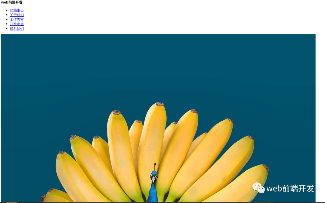
现在,让我们一起来看看我们项目的 HTML 代码结构,具体如下:
<!DOCTYPE html>
<html lang="en">
<head>
 <meta charset="UTF-8">
 <meta name="viewport" content="width=device-width, initial-scale=1.0">
 <title>如何用 HTML和CSS 实现一个响应式导航栏效果</title>
 <link rel="stylesheet" href="style.css">
</head>
<body>
 <nav>
 <input type="checkbox" id="nav-toggle">
 <div class="logo"><strong>web前端开发</strong></div>
 <ul class="links">
 <li><a href="#home">网站主页</a></li>
 <li><a href="#about">关于我们</a></li>
 <li><a href="#work">工作内容</a></li>
 <li><a href="#projects">开发项目</a></li>
 <li><a href="#contact">联系我们</a></li>
 </ul>
 <label for="nav-toggle" class="icon-burger">
 <div class="line"></div>
 <div class="line"></div>
 <div class="line"></div>
 </label>
 </nav>
 <div class="container">
 <img src="01.jpg" alt="">
 <img src="02.jpg" alt="">
 </div>
 <label for="nav-toggle" class="icon-burger">
 <div class="line"></div>
 <div class="line"></div>
 <div class="line"></div>
 </label>
</body>
</html>- 我们将从制作一个新的 HTML 文件开始。为了在多种字体样式之间切换,我们将在头部部分添加指向外部 CSS 文件和 Google 字体的链接。
- 现在,利用 <nav> 标签,我们将构建任何网页的标题或导航栏。
- 我们现在将在 nav 标签中添加一个带有徽标的 div 元素,我们将使用无序列表将不同的菜单项添加到我们的导航栏。
- 为了使用菜单项链接到不同的部分,我们将锚元素放在列表项中。
- 我们现在将使用 label 标签为我们的导航栏切换添加标签,稍后我们将使用它来使用 CSS 为我们的导航栏响应。
- 为了帮助大家理解标题的引用,我们在容器中放置了两个图像。
现在,让我们看看页面的结构输出的效果:
body {
 padding: 0;
 margin: 0;
 }
 .container {
 position: relative;
 margin-top: 100px;
 }
 .container img {
 display: block;
 width: 100%;
 }
 nav {
 position: fixed;
 z-index: 10;
 left: 0;
 right: 0;
 top: 0;
 font-family: "Montserrat", "sans-serif";
 height: 100px;
 background-color: #00a6bc;
 padding: 0 5%;
 }
 nav .logo {
 float: left;
 width: 40%;
 height: 100%;
 display: flex;
 align-items: center;
 font-size: 24px;
 color: #fff;
 }
 nav .links {
 float: right;
 padding: 0;
 margin: 0;
 width: 60%;
 height: 100%;
 display: flex;
 justify-content: space-around;
 align-items: center;
 }
 nav .links li {
 list-style: none;
 }
 nav .links a {
 display: block;
 padding: 1em;
 font-size: 16px;
 font-weight: bold;
 color: #fff;
 text-decoration: none;
 position: relative;
 }
 nav .links a:hover {
 color: white;
 }
 nav .links a::before {
 content: "";
 position: absolute;
 bottom: 0;
 left: 0;
 width: 100%;
 height: 2px;
 background-color: white;
 visibility: hidden;
 transform: scaleX(0);
 transition: all 0.3s ease-in-out 0s;
 }
 nav .links a:hover::before {
 visibility: visible;
 transform: scaleX(1);
 color: white;
 }
 #nav-toggle {
 position: absolute;
 top: -100px;
 }
 nav .icon-burger {
 display: none;
 position: absolute;
 right: 5%;
 top: 50%;
 transform: translateY(-50%);
 }
 nav .icon-burger .line {
 width: 30px;
 height: 5px;
 background-color: #fff;
 margin: 5px;
 border-radius: 3px;
 transition: all 0.5s ease-in-out;
 }
 @media screen and (max-width: 768px) {
 nav .logo {
 float: none;
 width: auto;
 justify-content: center;
 }
 nav .links {
 float: none;
 position: fixed;
 z-index: 9;
 left: 0;
 right: 0;
 top: 100px;
 bottom: 100%;
 width: auto;
 height: auto;
 flex-direction: column;
 justify-content: space-evenly;
 background-color: rgba(0, 0, 0, 0.8);
 overflow: hidden;
 transition: all 0.5s ease-in-out;
 }
 nav .links a {
 font-size: 20px;
 }
 nav :checked ~ .links {
 bottom: 0;
 }
 nav .icon-burger {
 display: block;
 }
 nav :checked ~ .icon-burger .line:nth-child(1) {
 transform: translateY(10px) rotate(225deg);
 }
 nav :checked ~ .icon-burger .line:nth-child(3) {
 transform: translateY(-10px) rotate(-225deg);
 }
 nav :checked ~ .icon-burger .line:nth-child(2) {
 opacity: 0;
 }
 }
body {
 padding: 0;
 margin: 0;
}
.container {
 position: relative;
 margin-top: 100px;
}
.container img {
 display: block;
 width: 100%;
}
nav {
 position: fixed;
 z-index: 10;
 left: 0;
 right: 0;
 top: 0;
 font-family: "Montserrat", "sans-serif";
 height: 100px;
 background-color: #00a6bc;
 padding: 0 5%;
}
nav .logo {
 float: left;
 width: 40%;
 height: 100%;
 display: flex;
 align-items: center;
 font-size: 24px;
 color: #fff;
}
nav .links {
 float: right;
 padding: 0;
 margin: 0;
 width: 60%;
 height: 100%;
 display: flex;
 justify-content: space-around;
 align-items: center;
}
nav .links li {
list-style: none;
}
nav .links a {
display: block;
padding: 1em;
font-size: 16px;
font-weight: bold;
color: #fff;
text-decoration: none;
position: relative;
}
nav .links a:hover {
color: white;
}
nav .links a::before {
content: "";
position: absolute;
bottom: 0;
left: 0;
width: 100%;
height: 2px;
background-color: white;
visibility: hidden;
transform: scaleX(0);
transition: all 0.3s ease-in-out 0s;
}
nav .links a:hover::before {
visibility: visible;
transform: scaleX(1);
color: white;
}
#nav-toggle {
position: absolute;
top: -100px;
}
nav .icon-burger {
display: none;
position: absolute;
right: 5%;
top: 50%;
transform: translateY(-50%);
}
nav .icon-burger .line {
width: 30px;
height: 5px;
background-color: #fff;
margin: 5px;
border-radius: 3px;
transition: all 0.5s ease-in-out;
}
@media screen and (max-width: 768px) {
nav .logo {
float: none;
width: auto;
justify-content: center;
}
nav .links {
float: none;
position: fixed;
z-index: 9;
left: 0;
right: 0;
top: 100px;
bottom: 100%;
width: auto;
height: auto;
flex-direction: column;
justify-content: space-evenly;
background-color: rgba(0, 0, 0, 0.8);
overflow: hidden;
transition: all 0.5s ease-in-out;
}
nav .links a {
font-size: 20px;
}
nav :checked ~ .links {
bottom: 0;
}
nav .icon-burger {
display: block;
}
nav :checked ~ .icon-burger .line:nth-child(1) {
transform: translateY(10px) rotate(225deg);
}
nav :checked ~ .icon-burger .line:nth-child(3) {
transform: translateY(-10px) rotate(-225deg);
}
nav :checked ~ .icon-burger .line:nth-child(2) {
opacity: 0;
}
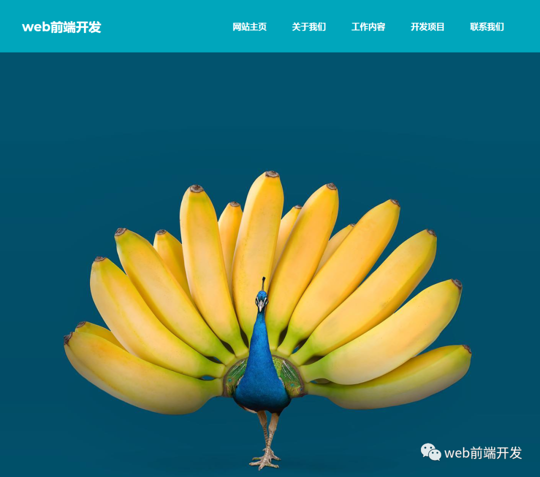
}添加完CSS后,我们将得到如下效果:
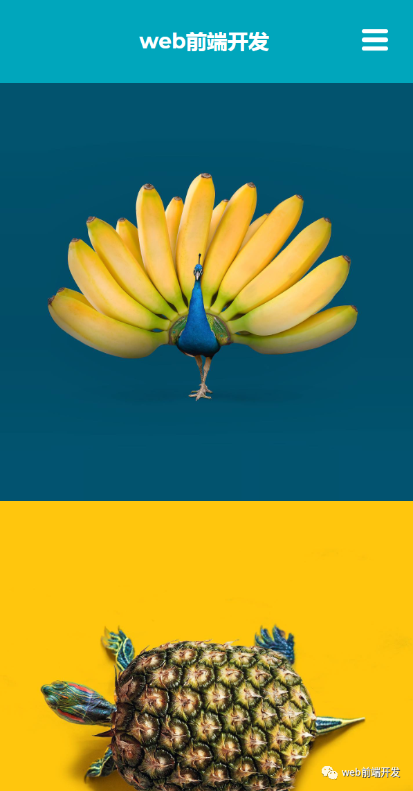
当我们把浏览器的窗口逐渐缩小时,页面上的导航菜单也会折叠起来:
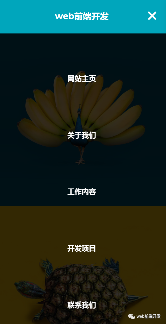
点击折叠汉堡菜单,我们就会看到导航栏其他内容,效果如下:
我们将使用类选择器 (.container) 来设计我们的图像。我们为图像添加了“100px”的上边距。我们的图像宽度设置为 100%,其显示设置为“block”。
body {
padding: 0;
margin: 0;
}
.container {
position: relative;
margin-top: 100px;
}
.container img {
display: block;
width: 100%;
}为了让它看起来更靠近窗口,我们将位置固定在网页上,并将 z-index 增加到 10。选择了“Montesirat”字体系列。高度设置为“100px”,背景色为“#00a6bc”。
nav {
position: fixed;
z-index: 10;
left: 0;
right: 0;
top: 0;
font-family: "Montserrat", "sans-serif";
height: 100px;
background-color: #00a6bc;
padding: 0 5%;
}我们指定它应该“浮动到窗口的左侧”。高度和宽度的定义分别为“100%”和“40%”。
文章居中对齐,字体颜色为“白色”。
我们为导航栏中的链接添加了一些样式。他们的位置被描述为“向右浮动”。宽度和高度的定义分别为“60%”和“100%”。这些项目居中并且显示设置为“flex”。
nav .logo {
float: left;
width: 40%;
height: 100%;
display: flex;
align-items: center;
font-size: 24px;
color: #fff;
}
nav .links {
float: right;
padding: 0;
margin: 0;
width: 60%;
height: 100%;
display: flex;
justify-content: space-around;
align-items: center;
}字体大小设置为 16px,文本装饰为无,字体颜色为“白色”,我们添加了一些悬停属性,当用户悬停时,白色底部边框将出现在链接下方。
nav .links {
 float: right;
 padding: 0;
 margin: 0;
 width: 60%;
 height: 100%;
 display: flex;
 justify-content: space-around;
 align-items: center;
}
nav .links li {
 list-style: none;
}
nav .links a {
 display: block;
 padding: 1em;
 font-size: 16px;
 font-weight: bold;
 color: #fff;
 text-decoration: none;
 position: relative;
}
nav .links a:hover {
 color: white;
}
nav .links a::before {
 content: "";
 position: absolute;
 bottom: 0;
 left: 0;
 width: 100%;
 height: 2px;
 background-color: white;
 visibility: hidden;
 transform: scaleX(0);
 transition: all 0.3s ease-in-out 0s;
}
nav .links a:hover::before {
 visibility: visible;
 transform: scaleX(1);
 color: white;
}
#nav-toggle {
 position: absolute;
 top: -100px;
}
nav .icon-burger {
 display: none;
 position: absolute;
 right: 5%;
 top: 50%;
 transform: translateY(-50%);
}
nav .icon-burger .line {
 width: 30px;
 height: 5px;
 background-color: #fff;
 margin: 5px;
 border-radius: 3px;
 transition: all 0.5s ease-in-out;
}
我们将在 CSS 中添加一个响应性和测试功能,以添加一个切换栏来显示菜单项。
@media screen and (max-width: 768px) {
 nav .logo {
 float: none;
 width: auto;
 justify-content: center;
 }
 nav .links {
 float: none;
 position: fixed;
 z-index: 9;
 left: 0;
 right: 0;
 top: 100px;
 bottom: 100%;
 width: auto;
 height: auto;
 flex-direction: column;
 justify-content: space-evenly;
 background-color: rgba(0, 0, 0, 0.8);
 overflow: hidden;
 transition: all 0.5s ease-in-out;
 }
 nav .links a {
 font-size: 20px;
 }
 nav :checked ~ .links {
 bottom: 0;
 }
 nav .icon-burger {
 display: block;
 }
 nav :checked ~ .icon-burger .line:nth-child(1) {
 transform: translateY(10px) rotate(225deg);
 }
 nav :checked ~ .icon-burger .line:nth-child(3) {
 transform: translateY(-10px) rotate(-225deg);
 }
 nav :checked ~ .icon-burger .line:nth-child(2) {
 opacity: 0;
 }
}
到这里,我们要实现的效果就算完成了,希望你也已经学会了怎么使用 HTML 和 CSS 来实现一个响应式导航栏效果了。
© 版权声明
文章版权归作者所有,未经允许请勿转载。


