
文章目录
- 以上15种水果你能看出都是什么水果吗?相对不够那么逼真,但是相信你也能猜出大概的名称。接下来将分别展开代码说明各自的实现过程,在不看下文的代码前可以先思考一下看到以上图片你会用什么方式去实现呢? 为保障文章的精华部分,部分非主要代码就不完整的贴出来了,如有不理解的地方可留言交流~
-
- 只需要一个标签,整体的苹果形状基于border-radius的不同数值显示,并通过box-shadow实现侧边阴影,两个伪元素实现顶部果把及两个突出的部分。 .apple { width: 6em; height: 5em; background-color: #ff4355; box-shadow: inset 0.2em -0.2em #cc1022; border-radius: 2em 2em 3em 3em; } .apple:before { top: -0.2em; left: 1.8em; content: ""; width: 4.1em; height: 2.75em; background-color: inherit; border-radius: 3em 3em 0 0; position: absolute; box-shadow: -1.5em 0 0 #ff4355, inset 0.2em 0.2em #ff4355; } .apple:after { content: ""; width: 0.2em; height: 1em; background-color: brown; position: absolute; z-index: 2; top: -0.5em; left: 3em; }
- 主体部分就是一个标签实现圆形并通过box-shadow增加阴影。再增加一个before伪元素实现叶子,叶子基于border实现,通过设置两个方向的颜色形成色差,设置两个方向的border-radius树叶的感觉就出来了。 .orange { width: 5.6em; height: 5.6em; border-radius: 50%; background-color: #ffb526; box-shadow: inset 0.2em -0.2em #cc8a0c; } .orange:before { content: ""; position: absolute; top: -1em; left: 3em; height: 0; width: 0; border: 1em solid #539e3d; border-radius: 50% 0 50% 0; border-bottom-color: #437512; border-right-color: #437512; }
- 香蕉的头尾基于两个伪元素实现,再增加一个元素banana-line实现阴影的对立高亮部分,弯曲的状态都是基于border-radius和box-shadow实现。 .banana { width: 6em; height: 6em; background-color: transparent; box-shadow: -1.1em 1.1em 0 0 #fcd110; border-radius: 50%; } .banana:before { content: ""; width: 0.3em; height: 0.3em; transform: rotate(45deg); background-color: #937714; position: absolute; top: 5.4em; left: 4.3em; z-index: 1; } .banana:after { content: ""; width: 0.4em; height: 0.8em; transform: rotate(31deg); background-color: #b3bb03; position: absolute; top: 1.1em; left: 0.2em; z-index: 1; } .banana-line { width: 5.5em; height: 5.8em; background-color: transparent; box-shadow: -0.4em 0.4em 0 0 #ffe23c; border-radius: 50%; position: absolute; top: -0.7em; left: 1.7em; transform: rotate(-4deg); }
- 这个相对更简单,只需要一个元素,主要是用到border-radius和box-shadow实现,再增加一个rotate旋转就完成了。 .lemon { width: 5.1em; height: 5.1em; margin: 0.8em; background-color: #ffe135; border-radius: 50% 15%; box-shadow: inset 0.2em 0.2em #ccb42a; transform: rotate(225deg); }
- 主体部分通过设置一个方向较小数值的border-radius,再增加rotate旋转。伪元素实现顶部的把部分。 .pear { width: 5.4em; height: 5.4em; margin-top: 1.2em; background-color: #d7c322; border-radius: 50% 15% 50% 50%; transform: rotate(-45deg); box-shadow: inset 0.15em 0.25em #c3b11f; } .pear:after { content: ""; width: 0.2em; height: 1em; background-color: brown; position: absolute; z-index: 2; top: -0.2em; left: 5.1em; transform: rotate(45deg); }
- 主体部分和梨比较像,只是方向不一样,草莓上的多个白点并不是多个元素,是基于box-shadow的多个参数实现。顶部的叶子看着是一个六角形,其实就是两个三角形不同的角度叠在一起实现。 .strawberry { width: 5em; height: 5em; margin-top: 0.7em; background-color: #ed2607; border-radius: 50% 15% 50% 50%; transform: rotate(135deg); box-shadow: inset -0.15em -0.25em #c62106; } .strawberry:before { content: ""; position: absolute; top: 3.5em; left: 2em; width: 0.3em; height: 0.3em; background-color: white; border-radius: 50%; box-shadow: 1.7em 0 0 0 white, -1em -2.8em 0 0 white, 2.5em -1.5em 0 0 white, 2em -2.5em 0 0 white, 0.75em -1.5em 0 0 white, -1em -1em 0 0 white, 0.8em -3.2em 0 0 white; }
- 这个相对比较简单,都是基于上面的侧边阴影,再增加伪元素到顶部实现阴影部分。 .blueberry { width: 6em; height: 5.5em; border-radius: 50%; background-color: #89a2ca; box-shadow: inset 0.2em -0.2em #6081b8; } .blueberry:before { content: ""; width: 2em; height: 1em; left: 2em; position: absolute; background-color: #3e4d64; border-radius: 50%; }
- 这个和#2的橘子类似,就border-radius的数值不一样,其他都是类似。 .peach { width: 6em; height: 5em; background-color: #f87a95; box-shadow: inset 0.2em -0.2em #cd6179; border-radius: 2.5em 2.5em 3em 3em; } .peach:before { content: ""; position: absolute; top: -1.7em; left: 3em; height: 0; width: 0; border: 1em solid #539e3d; border-radius: 50% 0 50% 0; border-bottom-color: #437512; border-right-color: #437512; }
- 两颗樱桃分别是两个不同的元素实现,但本质的代码都是一样的,只是对应的位置不一样。说明一下绿色的把如何实现的,定义一个透明的长方形块,增加50%的border-radius,再使用box-shadow填充绿色。 .cherry { width: 3em; height: 2.5em; background-color: #c20e2b; box-shadow: inset 0.2em -0.2em #9b0b22; border-radius: 2.5em 2.5em 4em 4em; position: absolute; } .cherry1 { top: 3em; left: 0.2em; transform: rotate(15deg); } .cherry2 { top: 3em; left: 3.4em; transform: rotate(-15deg); } .cherry1:before { content: ""; width: 1em; height: 2.8em; background-color: transparent; box-shadow: 0.2em -0.1em 0 0 #539e3d; border-radius: 50%; position: absolute; top: -2.6em; left: 1em; transform: rotate(19deg); } .cherry2:before { content: ""; width: 1em; height: 2.8em; background-color: transparent; box-shadow: 0.2em -0.1em 0 0 #539e3d; border-radius: 50%; position: absolute; top: -2.5em; left: 0.5em; transform: rotate(-12deg); } .cherry-join { width: 0.7em; height: 0.4em; top: 0.6em; left: 3.1em; position: absolute; background-color: #724126; border-radius: 20%; transform: rotate(-12deg); }
- 这个相对就比较复杂了,定义很多个元素实现每颗果实,通过不同的定位实现。但是注意左边的每一颗都有阴影,所有结构上保持一左一右。后面通过nth-child(2n + 0)即可设置阴影。顶部的叶子和草莓一致,两个三角形结合。 .berry { width: 1.7em; height: 3.5em; border-radius: 10% 10% 50% 50%; position: absolute; left: 2.5em; top: 1.1em; z-index: 1; } .raspberry { background-color: #d33653; border-left: 0.3em solid #d33653; border-right: 0.3em solid #d33653; } .berry-ball { width: 1.3em; height: 1.3em; position: absolute; border-radius: 50%; } .berry-ball1 { top: 4.1em; left: 2.6em; } ...code .berry-ball8 { top: 1.5em; left: 3.9em; } .raspberry-leaf-up { top: 0.5em; left: 2.6em; z-index: 2; } .raspberry-leaf-down { top: 1em; left: 2.6em; z-index: 2; } .raspberry-ball:nth-child(2n + 0) { box-shadow: inset 0.1em -0.1em #a82b42; } .raspberry-ball { background-color: #d33653; }
- 同上一样,只是设置不同的颜色即可。 .blackberry-ball, .blackberry { background-color: #5d46a0; } .blackberry { border-left: 0.3em solid #5d46a0; border-right: 0.3em solid #5d46a0; } .blackberry-ball:nth-child(2n + 0) { box-shadow: inset 0.1em -0.1em #3d2475; }
- 设置一个方向的border-radius为100%,再增加一个绿色的边框,白色的西瓜子基于box-shadow的多个参数实现。为了逼真还增加了一个伪元素实现西瓜两边的阴影。 .watermelon { position: relative; width: 0; border: 2.2em solid #f33; border-radius: 100% 0 0 0; box-shadow: -0.25em -0.25em 0 0.25em #373; transform: rotate(-135deg); } .watermelon:before { content: ""; position: absolute; bottom: 0.2em; right: 0.2em; width: 0.33em; height: 0.33em; background-color: #fff; border-radius: 0 50%; box-shadow: 1.75em 0 0 0 #fff, 0 1.75em 0 0 #fff, 2.5em -1.5em 0 0 #fff, -1.5em 2.5em 0 0 #fff, 2em 2em 0 0 #fff; } .watermelon:after { content: ""; position: absolute; top: -2.6em; left: -2.6em; width: 4.8em; height: 4.8em; box-shadow: inset -0.35em -0.35em rgba(0, 0, 0, 0.2); }
- 主要分为两块内容,果肉是一块,果核是一块,果肉部分通过设置border-radius实现椭圆形状,并通过不同的背景色和边框颜色画出深浅部分。果核部分通过伪元素模拟出反光的部分,让结果更逼真。 .avocado { position: relative; width: 3em; height: 4.2em; margin-left: 1em; background: #cde06d; border-radius: 50% 50% 50% 50% / 75% 75% 40% 40%; border: 0.6em solid #9fcd65; box-shadow: 0 0 0 2px #3c632b; } .inner { position: absolute; bottom: 8%; left: 16%; background: #98602d; border: 0.2em solid #704f31; width: 55%; height: 48%; border-radius: 50% 50% 50% 50% / 60% 60% 40% 40%; } .inner:after { content: ""; height: 80%; width: 80%; opacity: 0.7; background: #ffffff; position: absolute; left: 13%; top: 14%; transform: rotate(8deg); border-radius: 50% 50% 50% 50% / 60% 60% 40% 40%; } .inner:before { content: ""; position: absolute; width: 80%; height: 95%; left: 6%; background: #98602d; transform: rotate(20deg); border-radius: 50% 50% 50% 50% / 60% 60% 40% 40%; z-index: 1; }
- 主要也可分为两部分,内部将果肉分为六块的是三条线,基于一个元素和元素内部的两个伪元素实现。另一部分就实现主要的果皮和果肉部分,通过设置不同的box-shadow画出不同深浅的橙色。 .fruit-orange { width: 5em; height: 5em; border-radius: 50%; position: relative; display: flex; justify-content: center; align-items: center; background: #f57400; } .fruit-orange::after { content: ""; position: absolute; width: 0.5em; height: 0.5em; top: calc(50% - 0.22em); left: calc(50% - 0.22em); background: #fffab9; z-index: 10; border-radius: 50%; box-shadow: 0 0 3px 2px #fffab9; } .fruit-orange::before { position: absolute; content: ""; width: 100%; height: 100%; border: 1px solid #f57400; box-shadow: 0 0 0.1em 1px rgb(0, 0, 0, 0.4), 0 0 1px 0.2em #fec70c inset, 0 0 0.2em 0.3em #fce819 inset, 0 0 0.2em 0.5em #fffab9 inset, 0 0 0.2em 0.7em #fffab9 inset; border-radius: 50%; } .slices { position: absolute; z-index: 5; width: 4em; height: 0.3em; background: #fffab9; box-shadow: 0 0 0.05em 1px #fffab9; } .slices::before { content: ""; position: absolute; z-index: 5; top: 0px; left: 0px; width: 100%; height: 100%; background: #fffab9; transform-origin: center; transform: rotate(60deg); box-shadow: 0 0 0.05em 1px #fffab9; } .slices::after { content: ""; position: absolute; z-index: 5; top: 0px; left: 0px; width: 100%; height: 100%; background: #fffab9; transform-origin: center; transform: rotate(120deg); box-shadow: 0 0 0.05em 1px #fffab9; }
- 这个和#14切面橙子实现方式一样,只是设置不同的颜色,基于这个代码还可以画出西柚等类似水果。 .fruit-lemon { background: #fddd09; width: 5em; height: 5em; border-radius: 50%; position: relative; display: flex; justify-content: center; align-items: center; } .fruit-lemon::before { position: absolute; content: ""; width: 100%; height: 100%; border: 1px solid #e9ce1d; box-shadow: 0 0 0.1em 1px rgb(0, 0, 0, 0.4), 0 0 1px 0.2em #fec70c inset, 0 0 0.2em 0.3em #fce819 inset, 0 0 0.2em 0.5em #fffab9 inset, 0 0 0.2em 0.7em #fffab9 inset; border-radius: 50%; }
- 整体代码分析就结束啦,看到最后和你预期的相差多远呢。如果你有更多更好的方案欢迎留言交流。如果觉得有用,记得点赞收藏哦,说不定哪天就用上啦~ 专注前端开发,分享前端相关技术干货,公众号:南城大前端(ID: nanchengfe)
今日是农历六月初一。不知不觉地又是一年夏天来临了,面对烈日炎炎,夏天要吃的水果那是必不可少,今天就用CSS来给大家带来一个水果拼盘,提前给大家解解暑~,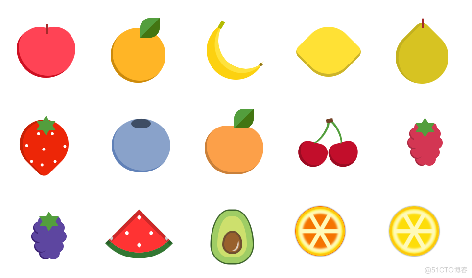 ,以上15种水果你能看出都是什么水果吗?相对不够那么逼真,但是相信你也能猜出大概的名称。接下来将分别展开代码说明各自的实现过程,在不看下文的代码前可以先思考一下看到以上图片你会用什么方式去实现呢?,为保障文章的精华部分,部分非主要代码就不完整的贴出来了,如有不理解的地方可留言交流~,只需要一个标签,整体的苹果形状基于
border-radius的不同数值显示,并通过
box-shadow实现侧边阴影,两个伪元素实现顶部果把及两个突出的部分。,主体部分就是一个标签实现圆形并通过
box-shadow增加阴影。再增加一个
before伪元素实现叶子,叶子基于
border实现,通过设置两个方向的颜色形成色差,设置两个方向的
border-radius树叶的感觉就出来了。,香蕉的头尾基于两个伪元素实现,再增加一个元素
banana-line实现阴影的对立高亮部分,弯曲的状态都是基于
border-radius和
box-shadow实现。,这个相对更简单,只需要一个元素,主要是用到
border-radius和
box-shadow实现,再增加一个
rotate旋转就完成了。,主体部分通过设置一个方向较小数值的
border-radius,再增加
rotate旋转。伪元素实现顶部的把部分。,主体部分和梨比较像,只是方向不一样,草莓上的多个白点并不是多个元素,是基于
box-shadow的多个参数实现。顶部的叶子看着是一个六角形,其实就是两个三角形不同的角度叠在一起实现。,这个相对比较简单,都是基于上面的侧边阴影,再增加伪元素到顶部实现阴影部分。,这个和#2的橘子类似,就
border-radius的数值不一样,其他都是类似。,两颗樱桃分别是两个不同的元素实现,但本质的代码都是一样的,只是对应的位置不一样。说明一下绿色的把如何实现的,定义一个透明的长方形块,增加50%的
border-radius,再使用
box-shadow填充绿色。,这个相对就比较复杂了,定义很多个元素实现每颗果实,通过不同的定位实现。但是注意左边的每一颗都有阴影,所有结构上保持一左一右。后面通过
nth-child(2n + 0)即可设置阴影。顶部的叶子和草莓一致,两个三角形结合。,同上一样,只是设置不同的颜色即可。,设置一个方向的
border-radius为100%,再增加一个绿色的边框,白色的西瓜子基于
box-shadow的多个参数实现。为了逼真还增加了一个伪元素实现西瓜两边的阴影。,主要分为两块内容,果肉是一块,果核是一块,果肉部分通过设置
border-radius实现椭圆形状,并通过不同的背景色和边框颜色画出深浅部分。果核部分通过伪元素模拟出反光的部分,让结果更逼真。,主要也可分为两部分,内部将果肉分为六块的是三条线,基于一个元素和元素内部的两个伪元素实现。另一部分就实现主要的果皮和果肉部分,通过设置不同的
box-shadow画出不同深浅的橙色。,这个和#14切面橙子实现方式一样,只是设置不同的颜色,基于这个代码还可以画出西柚等类似水果。,整体代码分析就结束啦,看到最后和你预期的相差多远呢。如果你有更多更好的方案欢迎留言交流。如果觉得有用,记得点赞收藏哦,说不定哪天就用上啦~,专注前端开发,分享前端相关技术干货,公众号:南城大前端(ID: nanchengfe),主要分为两块内容,果肉是一块,果核是一块,果肉部分通过设置
border-radius实现椭圆形状,并通过不同的背景色和边框颜色画出深浅部分。果核部分通过伪元素模拟出反光的部分,让结果更逼真。,
今日是农历六月初一。不知不觉地又是一年夏天来临了,面对烈日炎炎,夏天要吃的水果那是必不可少,今天就用CSS来给大家带来一个水果拼盘,提前给大家解解暑~
以上15种水果你能看出都是什么水果吗?相对不够那么逼真,但是相信你也能猜出大概的名称。接下来将分别展开代码说明各自的实现过程,在不看下文的代码前可以先思考一下看到以上图片你会用什么方式去实现呢?
为保障文章的精华部分,部分非主要代码就不完整的贴出来了,如有不理解的地方可留言交流~
只需要一个标签,整体的苹果形状基于border-radius的不同数值显示,并通过box-shadow实现侧边阴影,两个伪元素实现顶部果把及两个突出的部分。
.apple {
 width: 6em;
 height: 5em;
 background-color: #ff4355;
 box-shadow: inset 0.2em -0.2em #cc1022;
 border-radius: 2em 2em 3em 3em;
}
.apple:before {
 top: -0.2em;
 left: 1.8em;
 content: "";
 width: 4.1em;
 height: 2.75em;
 background-color: inherit;
 border-radius: 3em 3em 0 0;
 position: absolute;
 box-shadow: -1.5em 0 0 #ff4355, inset 0.2em 0.2em #ff4355;
}
.apple:after {
 content: "";
 width: 0.2em;
 height: 1em;
 background-color: brown;
 position: absolute;
 z-index: 2;
 top: -0.5em;
 left: 3em;
}
主体部分就是一个标签实现圆形并通过box-shadow增加阴影。再增加一个before伪元素实现叶子,叶子基于border实现,通过设置两个方向的颜色形成色差,设置两个方向的border-radius树叶的感觉就出来了。
.orange {
 width: 5.6em;
 height: 5.6em;
 border-radius: 50%;
 background-color: #ffb526;
 box-shadow: inset 0.2em -0.2em #cc8a0c;
}
.orange:before {
 content: "";
 position: absolute;
 top: -1em;
 left: 3em;
 height: 0;
 width: 0;
 border: 1em solid #539e3d;
 border-radius: 50% 0 50% 0;
 border-bottom-color: #437512;
 border-right-color: #437512;
}
香蕉的头尾基于两个伪元素实现,再增加一个元素banana-line实现阴影的对立高亮部分,弯曲的状态都是基于border-radius和box-shadow实现。
.banana {
 width: 6em;
 height: 6em;
 background-color: transparent;
 box-shadow: -1.1em 1.1em 0 0 #fcd110;
 border-radius: 50%;
}
.banana:before {
 content: "";
 width: 0.3em;
 height: 0.3em;
 transform: rotate(45deg);
 background-color: #937714;
 position: absolute;
 top: 5.4em;
 left: 4.3em;
 z-index: 1;
}
.banana:after {
 content: "";
 width: 0.4em;
 height: 0.8em;
 transform: rotate(31deg);
 background-color: #b3bb03;
 position: absolute;
 top: 1.1em;
 left: 0.2em;
 z-index: 1;
}
.banana-line {
 width: 5.5em;
 height: 5.8em;
 background-color: transparent;
 box-shadow: -0.4em 0.4em 0 0 #ffe23c;
 border-radius: 50%;
 position: absolute;
 top: -0.7em;
 left: 1.7em;
 transform: rotate(-4deg);
}
这个相对更简单,只需要一个元素,主要是用到border-radius和box-shadow实现,再增加一个rotate旋转就完成了。
.lemon {
 width: 5.1em;
 height: 5.1em;
 margin: 0.8em;
 background-color: #ffe135;
 border-radius: 50% 15%;
 box-shadow: inset 0.2em 0.2em #ccb42a;
 transform: rotate(225deg);
}
主体部分通过设置一个方向较小数值的border-radius,再增加rotate旋转。伪元素实现顶部的把部分。
.pear {
 width: 5.4em;
 height: 5.4em;
 margin-top: 1.2em;
 background-color: #d7c322;
 border-radius: 50% 15% 50% 50%;
 transform: rotate(-45deg);
 box-shadow: inset 0.15em 0.25em #c3b11f;
}
.pear:after {
 content: "";
 width: 0.2em;
 height: 1em;
 background-color: brown;
 position: absolute;
 z-index: 2;
 top: -0.2em;
 left: 5.1em;
 transform: rotate(45deg);
}
主体部分和梨比较像,只是方向不一样,草莓上的多个白点并不是多个元素,是基于box-shadow的多个参数实现。顶部的叶子看着是一个六角形,其实就是两个三角形不同的角度叠在一起实现。
.strawberry {
 width: 5em;
 height: 5em;
 margin-top: 0.7em;
 background-color: #ed2607;
 border-radius: 50% 15% 50% 50%;
 transform: rotate(135deg);
 box-shadow: inset -0.15em -0.25em #c62106;
}
.strawberry:before {
 content: "";
 position: absolute;
 top: 3.5em;
 left: 2em;
 width: 0.3em;
 height: 0.3em;
 background-color: white;
 border-radius: 50%;
 box-shadow: 1.7em 0 0 0 white, -1em -2.8em 0 0 white, 2.5em -1.5em 0 0 white,
 2em -2.5em 0 0 white, 0.75em -1.5em 0 0 white, -1em -1em 0 0 white,
 0.8em -3.2em 0 0 white;
}
这个相对比较简单,都是基于上面的侧边阴影,再增加伪元素到顶部实现阴影部分。
.blueberry {
 width: 6em;
 height: 5.5em;
 border-radius: 50%;
 background-color: #89a2ca;
 box-shadow: inset 0.2em -0.2em #6081b8;
}
.blueberry:before {
 content: "";
 width: 2em;
 height: 1em;
 left: 2em;
 position: absolute;
 background-color: #3e4d64;
 border-radius: 50%;
}
这个和#2的橘子类似,就border-radius的数值不一样,其他都是类似。
.peach {
 width: 6em;
 height: 5em;
 background-color: #f87a95;
 box-shadow: inset 0.2em -0.2em #cd6179;
 border-radius: 2.5em 2.5em 3em 3em;
}
.peach:before {
 content: "";
 position: absolute;
 top: -1.7em;
 left: 3em;
 height: 0;
 width: 0;
 border: 1em solid #539e3d;
 border-radius: 50% 0 50% 0;
 border-bottom-color: #437512;
 border-right-color: #437512;
}
两颗樱桃分别是两个不同的元素实现,但本质的代码都是一样的,只是对应的位置不一样。说明一下绿色的把如何实现的,定义一个透明的长方形块,增加50%的border-radius,再使用box-shadow填充绿色。
.cherry {
 width: 3em;
 height: 2.5em;
 background-color: #c20e2b;
 box-shadow: inset 0.2em -0.2em #9b0b22;
 border-radius: 2.5em 2.5em 4em 4em;
 position: absolute;
}
.cherry1 {
 top: 3em;
 left: 0.2em;
 transform: rotate(15deg);
}
.cherry2 {
 top: 3em;
 left: 3.4em;
 transform: rotate(-15deg);
}
.cherry1:before {
 content: "";
 width: 1em;
 height: 2.8em;
 background-color: transparent;
 box-shadow: 0.2em -0.1em 0 0 #539e3d;
 border-radius: 50%;
 position: absolute;
 top: -2.6em;
 left: 1em;
 transform: rotate(19deg);
}
.cherry2:before {
 content: "";
 width: 1em;
 height: 2.8em;
 background-color: transparent;
 box-shadow: 0.2em -0.1em 0 0 #539e3d;
 border-radius: 50%;
 position: absolute;
 top: -2.5em;
 left: 0.5em;
 transform: rotate(-12deg);
}
.cherry-join {
 width: 0.7em;
 height: 0.4em;
 top: 0.6em;
 left: 3.1em;
 position: absolute;
 background-color: #724126;
 border-radius: 20%;
 transform: rotate(-12deg);
}
这个相对就比较复杂了,定义很多个元素实现每颗果实,通过不同的定位实现。但是注意左边的每一颗都有阴影,所有结构上保持一左一右。后面通过nth-child(2n + 0)即可设置阴影。顶部的叶子和草莓一致,两个三角形结合。
.berry {
 width: 1.7em;
 height: 3.5em;
 border-radius: 10% 10% 50% 50%;
 position: absolute;
 left: 2.5em;
 top: 1.1em;
 z-index: 1;
}
.raspberry {
 background-color: #d33653;
 border-left: 0.3em solid #d33653;
 border-right: 0.3em solid #d33653;
}
.berry-ball {
 width: 1.3em;
 height: 1.3em;
 position: absolute;
 border-radius: 50%;
}
.berry-ball1 {
 top: 4.1em;
 left: 2.6em;
}
...code
.berry-ball8 {
 top: 1.5em;
 left: 3.9em;
}
.raspberry-leaf-up {
 top: 0.5em;
 left: 2.6em;
 z-index: 2;
}
.raspberry-leaf-down {
 top: 1em;
 left: 2.6em;
 z-index: 2;
}
.raspberry-ball:nth-child(2n + 0) {
 box-shadow: inset 0.1em -0.1em #a82b42;
}
.raspberry-ball {
 background-color: #d33653;
}
同上一样,只是设置不同的颜色即可。
.blackberry-ball,
.blackberry {
 background-color: #5d46a0;
}
.blackberry {
 border-left: 0.3em solid #5d46a0;
 border-right: 0.3em solid #5d46a0;
}
.blackberry-ball:nth-child(2n + 0) {
 box-shadow: inset 0.1em -0.1em #3d2475;
}
设置一个方向的border-radius为100%,再增加一个绿色的边框,白色的西瓜子基于box-shadow的多个参数实现。为了逼真还增加了一个伪元素实现西瓜两边的阴影。
.watermelon {
 position: relative;
 width: 0;
 border: 2.2em solid #f33;
 border-radius: 100% 0 0 0;
 box-shadow: -0.25em -0.25em 0 0.25em #373;
 transform: rotate(-135deg);
}
.watermelon:before {
 content: "";
 position: absolute;
 bottom: 0.2em;
 right: 0.2em;
 width: 0.33em;
 height: 0.33em;
 background-color: #fff;
 border-radius: 0 50%;
 box-shadow: 1.75em 0 0 0 #fff, 0 1.75em 0 0 #fff, 2.5em -1.5em 0 0 #fff,
 -1.5em 2.5em 0 0 #fff, 2em 2em 0 0 #fff;
}
.watermelon:after {
 content: "";
 position: absolute;
 top: -2.6em;
 left: -2.6em;
 width: 4.8em;
 height: 4.8em;
 box-shadow: inset -0.35em -0.35em rgba(0, 0, 0, 0.2);
}
主要分为两块内容,果肉是一块,果核是一块,果肉部分通过设置border-radius实现椭圆形状,并通过不同的背景色和边框颜色画出深浅部分。果核部分通过伪元素模拟出反光的部分,让结果更逼真。
.avocado {
 position: relative;
 width: 3em;
 height: 4.2em;
 margin-left: 1em;
 background: #cde06d;
 border-radius: 50% 50% 50% 50% / 75% 75% 40% 40%;
 border: 0.6em solid #9fcd65;
 box-shadow: 0 0 0 2px #3c632b;
}

.inner {
 position: absolute;
 bottom: 8%;
 left: 16%;
 background: #98602d;
 border: 0.2em solid #704f31;
 width: 55%;
 height: 48%;
 border-radius: 50% 50% 50% 50% / 60% 60% 40% 40%;
}
.inner:after {
 content: "";
 height: 80%;
 width: 80%;
 opacity: 0.7;
 background: #ffffff;
 position: absolute;
 left: 13%;
 top: 14%;
 transform: rotate(8deg);
 border-radius: 50% 50% 50% 50% / 60% 60% 40% 40%;
}
.inner:before {
 content: "";
 position: absolute;
 width: 80%;
 height: 95%;
 left: 6%;
 background: #98602d;
 transform: rotate(20deg);
 border-radius: 50% 50% 50% 50% / 60% 60% 40% 40%;
 z-index: 1;
}
主要也可分为两部分,内部将果肉分为六块的是三条线,基于一个元素和元素内部的两个伪元素实现。另一部分就实现主要的果皮和果肉部分,通过设置不同的box-shadow画出不同深浅的橙色。
.fruit-orange {
 width: 5em;
 height: 5em;
 border-radius: 50%;
 position: relative;
 display: flex;
 justify-content: center;
 align-items: center;
 background: #f57400;
}

.fruit-orange::after {
 content: "";
 position: absolute;
 width: 0.5em;
 height: 0.5em;
 top: calc(50% - 0.22em);
 left: calc(50% - 0.22em);
 background: #fffab9;
 z-index: 10;
 border-radius: 50%;
 box-shadow: 0 0 3px 2px #fffab9;
}

.fruit-orange::before {
 position: absolute;
 content: "";
 width: 100%;
 height: 100%;
 border: 1px solid #f57400;
 box-shadow: 0 0 0.1em 1px rgb(0, 0, 0, 0.4), 0 0 1px 0.2em #fec70c inset,
 0 0 0.2em 0.3em #fce819 inset, 0 0 0.2em 0.5em #fffab9 inset,
 0 0 0.2em 0.7em #fffab9 inset;
 border-radius: 50%;
}

.slices {
 position: absolute;
 z-index: 5;
 width: 4em;
 height: 0.3em;
 background: #fffab9;
 box-shadow: 0 0 0.05em 1px #fffab9;
}

.slices::before {
 content: "";
 position: absolute;
 z-index: 5;
 top: 0px;
 left: 0px;
 width: 100%;
 height: 100%;
 background: #fffab9;
 transform-origin: center;
 transform: rotate(60deg);
 box-shadow: 0 0 0.05em 1px #fffab9;
}

.slices::after {
 content: "";
 position: absolute;
 z-index: 5;
 top: 0px;
 left: 0px;
 width: 100%;
 height: 100%;
 background: #fffab9;
 transform-origin: center;
 transform: rotate(120deg);
 box-shadow: 0 0 0.05em 1px #fffab9;
}
这个和#14切面橙子实现方式一样,只是设置不同的颜色,基于这个代码还可以画出西柚等类似水果。
.fruit-lemon {
 background: #fddd09;
 width: 5em;
 height: 5em;
 border-radius: 50%;
 position: relative;
 display: flex;
 justify-content: center;
 align-items: center;
}

.fruit-lemon::before {
 position: absolute;
 content: "";
 width: 100%;
 height: 100%;
 border: 1px solid #e9ce1d;
 box-shadow: 0 0 0.1em 1px rgb(0, 0, 0, 0.4), 0 0 1px 0.2em #fec70c inset,
 0 0 0.2em 0.3em #fce819 inset, 0 0 0.2em 0.5em #fffab9 inset,
 0 0 0.2em 0.7em #fffab9 inset;
 border-radius: 50%;
}
整体代码分析就结束啦,看到最后和你预期的相差多远呢。如果你有更多更好的方案欢迎留言交流。如果觉得有用,记得点赞收藏哦,说不定哪天就用上啦~
专注前端开发,分享前端相关技术干货,公众号:南城大前端(ID: nanchengfe)
© 版权声明
文章版权归作者所有,未经允许请勿转载。

